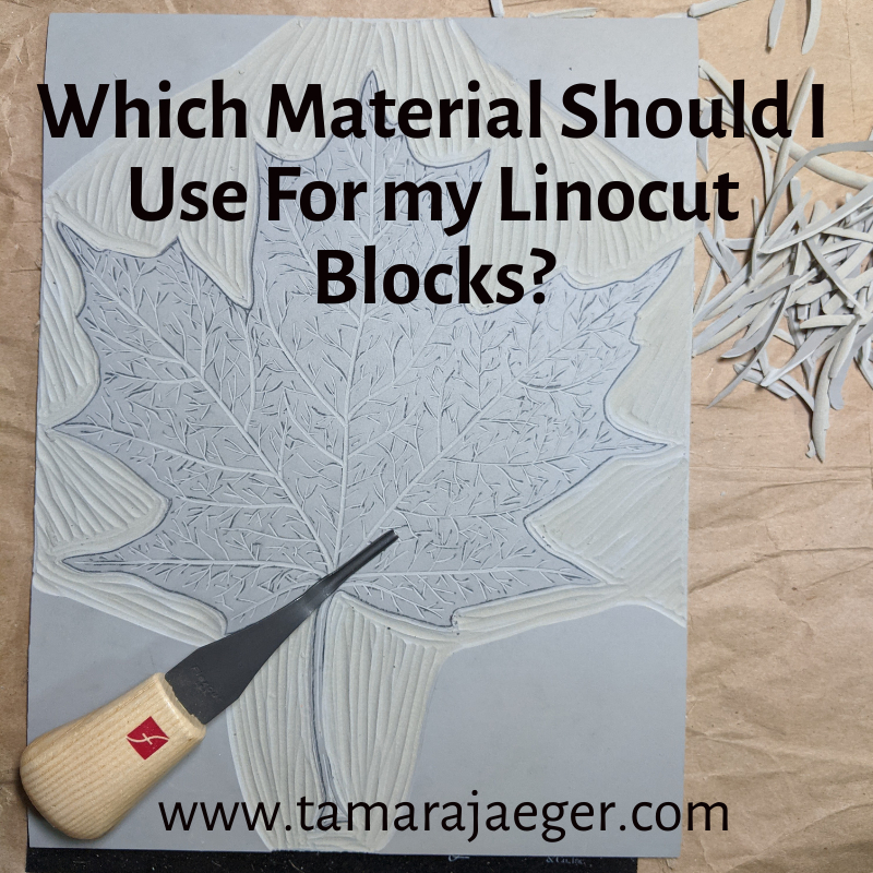

Which Material Should I Use For my Linocut Blocks?
Linocut is a printmaking technique similar to woodcut that uses a carved linoleum block to create an image. The block is inked and then pressed onto paper to create the print. You can use a variety of different materials for linocut blocks but like any material, each has advantages and disadvantages.

Linocut printing block materials: Speedy Carve, battleship grey lino, golden lino, Speedy-Cut
Traditional Linoleum: Traditional lino is made from a burlap-backed grey linoleum. This is the most common type of linocut block material and the one you’re most likely familiar with if you’ve done any linocut printmaking in school. It’s relatively inexpensive and easy to carve and produces sharp, detailed prints. However, traditional linoleum can become brittle with age and can crack if it is not handled carefully.
There’s also a version of traditional linoleum that is tan or golden in color rather than grey. This material is generally a bit softer and easier to carve than the grey version and doesn’t become as brittle over time but still produces sharp details.
You can get traditional linoleum that is mounted on wooden blocks or unmounted. Mounted lino is sturdier and less likely to curl or warp, because it is supported by the wooden block, but thicker, which can make positioning the paper a little more difficult.
I typically use unmounted lino because when I print, I place the block on the table first, then lay the paper down over it and apply pressure with a baren on the paper. You can place also the paper on the table, then place the inked block face-down on the paper and apply pressure to the back of the block. This method typically works better for the thicker mounted blocks and printing using a press rather than hand printing.
Vinyl Linoleum: Vinyl lino is a newer type of linocut block material that is made from a synthetic material. It is more expensive than traditional lino but is more durable and less likely to crack. The most common vinyl lino is Japanese vinyl, which has a blue side and a green side along with a black center. Either or both sides of the block can be carved. It’s a little softer than traditional lino but still produces sharp, detailed prints though it can be a little difficult to transfer the design to the block.
Softcut Lino: Softcut lino is made from a softer, more flexible rubber-like material. It’s easier to carve than traditional lino, especially for intricate designs, and is also less likely to crack. However, Softcut lino is more expensive than traditional lino and it can be difficult to produce really sharp prints.
Rubber: Rubber is another popular material for linocut blocks. It is more flexible, less likely to crack, and easier to carve than linoleum, making it a good choice for beginners. Its flexibility also means it can be used to print on curved surfaces. However, rubber can be more expensive than linoleum and can distort under pressure, making the prints less clear. Speed Ball Speedy-Carve is a common brand.
Foam: Foam is another material that is becoming increasingly popular for linocut blocks. It is inexpensive, very easy to carve, and produces soft lines. However, foam is not as durable as linoleum or rubber and can easily be damaged.
The best material for you will depend on your individual needs and preferences. If you are looking for a traditional material that is easy to carve and produces sharp lines, then traditional linoleum—either the battleship grey or the golden version—is a good choice. If you are looking for a material that is more flexible and less likely to crack, then rubber or vinyl are good options. If you are looking for a material that is easy to carve and inexpensive, then foam may be a good choice.

Carved linocut blocks
Want to stay up to date and see more of what I’m working on? Sign up for my mailing list here and get a FREE digital download of an exclusive tiger linocut print. (I promise not to be spammy with my emails—I hate that too!)
* Please note that this post contains affiliate links and any sales made through such links will reward me a small commission – at no extra cost for you.
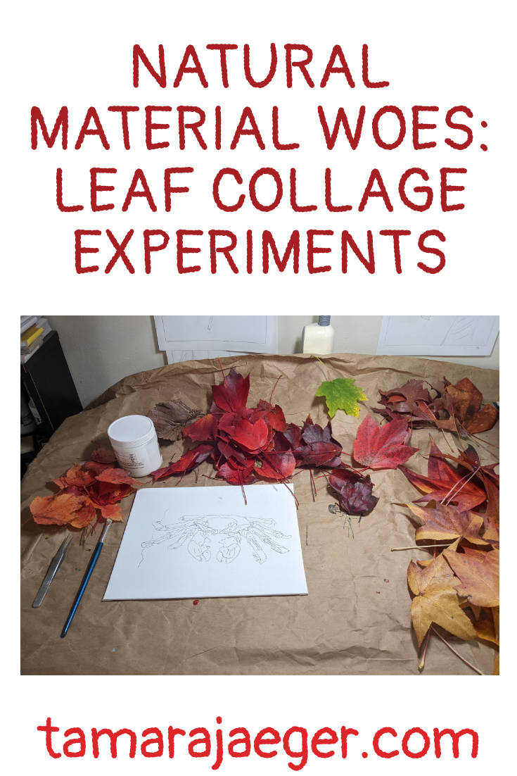
Natural Material Woes: Leaf Collage Experiments
I wrote previously about an experiment I did using leaves to make a collage. If you missed it, you can find the post here.
A year later, I know you’re all wondering, “How is the Red Panda leaf collage looking now?”
Well, actually not too bad. Most of the piece still looks pretty much the same as it did when it was first made. The only noticeable change is that the color of the yellow leaves in the background has faded. While that’s not ideal from an aging/longevity standpoint, aesthetically I’m not exactly crushed. I didn’t really like the super bright yellow color it had originally, so this more muted yellow is a bit nicer to look at.
I suspect it’s at least partially due to the yellow leaves being a bit ‘fresher’ than the brown ones, so the color wasn’t as stable. This, of course, begs the question: How will red, orange, or green leaves hold up over time?
This is definitely something that needs looking into! So, I created another experimental test piece, using red and green leaves, to see how those colors will age.
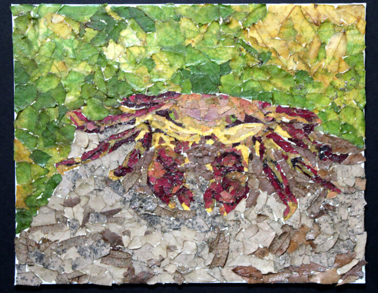
Here we have a red crab from the Galapagos islands. I thought he was pretty cool-looking and he had the right colors, so he was my test victim. I suspect I should have used a subject that had larger areas of red, like a cardinal, but oh, well! I’ll keep you posted on how this one ages as well.
If you’re curious about the materials I used (other than leaves!), here’s a list:
*Golden Acrylic Soft Gel Medium
*Winsor & Newton Galeria Acrylic Satin Varnish
I’m thinking of trying out flowers as a medium for collage as well. What do you think?
Want to stay up to date and see more of what I’m working on? Sign up for my mailing list here and get a FREE digital download of an exclusive tiger linocut print. (I promise not to be spammy with my emails—I hate that too!)
* Please note that this post contains affiliate links and any sales made through such links will reward me a small commission – at no extra cost for you.
Transferring a Sketch to Your Printmaking Block
As a follow up to my last post about creating an underdrawing for a painting or collage, which you can find here, I’m going to talk a little bit about how to transfer your image onto the plate or block for making a print.
So, you have an image you want to make a print of but now you need to get it onto the block or plate. How can we do it? Well, there are actually a lot of options, and I’ll go over a few of them here.
First, you can obviously draw directly onto the plate. For linocuts, this works fine. You can use pencil or pen, though there’s a tendency for the drawing to smudge or smear while carving the block. You also need to keep in mind that the image you draw on your block will print in reverse—if you have lettering or other elements that need to appear in a specific direction, you need to make sure they are drawn out on the block backwards!

Another option is to take your drawing or image and scribble over the back with a thick layer of pencil. Then you place the image on top of the block and trace the design. Keep in mind that the image will again print in reverse from what is drawn in the sketch using this method.
If you need your image to appear in the same orientation as the drawing (as in, not reversed), you can first trace the design in pencil on the FRONT of the drawing, then turn the paper face down onto the block. Next, you can scribble (or trace, if you can see it) over the image (from the back) using a pencil to transfer the pencil lines on the front onto the block. This method is a little more time-consuming, since it’s multiple steps, but your image will appear reversed on the block, which means that the final printed image will not be reversed and will look just like the drawing.
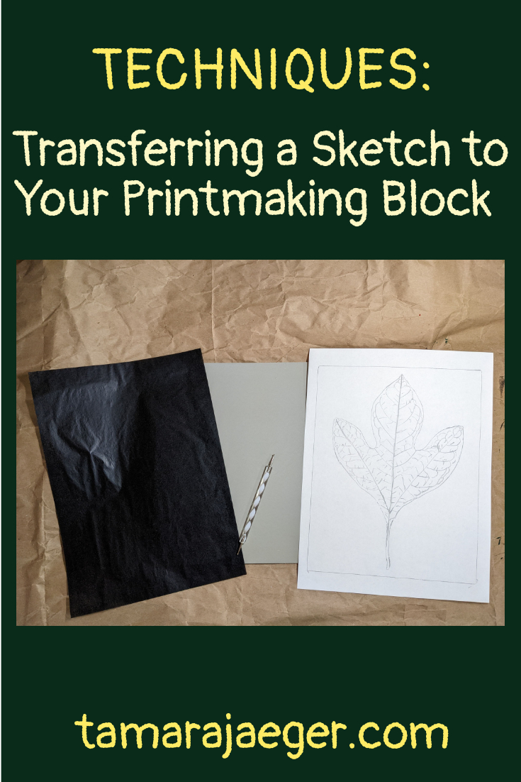
A bit easier that the pencil transfer method is using carbon paper or transfer paper. I switched to this a while back and it’s So much easier! Also, a lot less messy. You place a sheet of transfer paper between the block and the drawing (make sure the darker side, which is what actually transfers, is facing the block), then trace over the drawing using a pen, pencil, or stylus. Keep in mind, as always, that the image on the block will appear reversed in the final print. You can always use the two-step method above to trace the design onto the back of the paper, then trace that reversed image onto the block using the transfer paper. A lightbox can be a useful tool for retracing your drawing on the back, if you are having difficulty seeing the lines through the paper.
*Kingart Graphite Transfer Paper
*Artograph LightTracer Light Box
You can also use a projector to transfer the design, but unless you are working on a very large plate or have a projector that can focus very close to give a small image, it’s probably not an ideal method.
What tips or tricks have you found for transferring your image onto a printmaking plate or block? Tell me in the comments.
Want to stay up to date and see more of what I’m working on? Sign up for my mailing list here and get a FREE digital download of an exclusive tiger linocut print. (I promise not to be spammy with my emails—I hate that too!)
* Please note that this post contains affiliate links and any sales made through such links will reward me a small commission – at no extra cost for you.
I’m Terrible at Drawing! How Can I Draw the Sketch for Paintings and Collages?
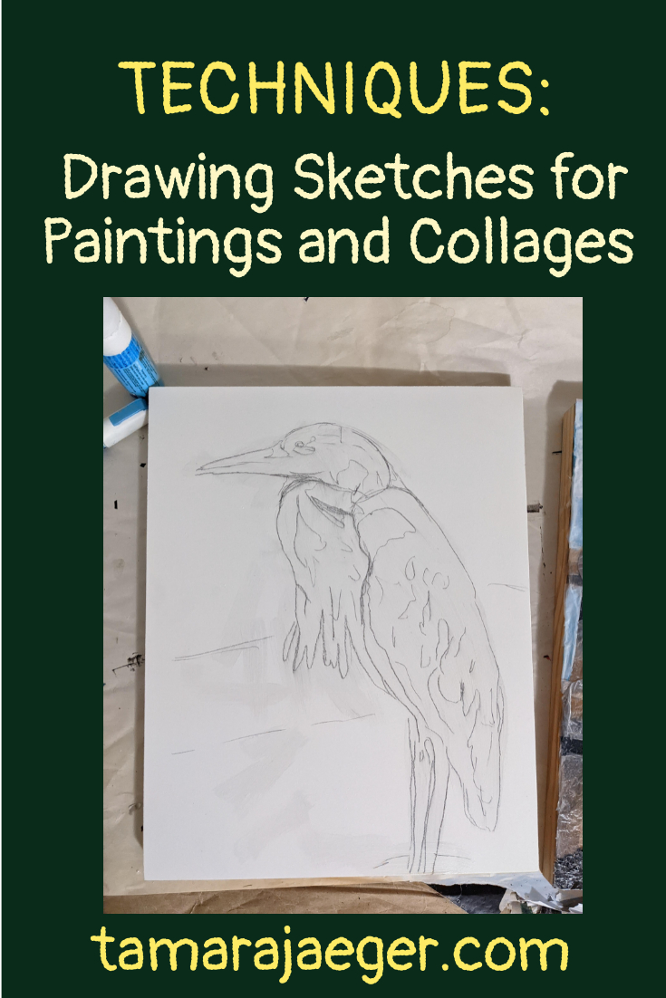
Let’s talk about underdrawings today. An underdrawing is a sketch of a design that is drawn on the paper, canvas, or panel prior to painting or otherwise creating the final artwork. The underdrawing serves to guide the artist during the creation of the piece and so is a critical part of the process—if the underdrawing isn’t right, it can be incredibly difficult to correct the composition while working on the piece.
I confess, I actually don’t like drawing. I mean, I can do it, certainly, but it’s not something I do for fun. I’m definitely not one of those artists you see running around with a sketchbook, constantly drawing everything. But I can’t deny that drawing is a critical skill for creating my torn paper collages, paintings, prints, and other types of art.
“But I can’t draw!” I hear some of you saying. Well, the good news is that there are some ways around that.
The most common method you see in drawing classes is probably the use of a grid to help get the proportions and angles correct. It breaks up the overall composition into sections and allows you to concentrate on the shapes and lines without focusing as much on the overall image. While it’s generally seen as a tool for learning to draw, there’s no reason it can’t be used to help with creating an underdrawing from a reference photo.
To use the grid method, you just divide your paper or canvas into a series of squares, a bit like a chess board. You then do the same to the reference photo. You can also place a clear plastic sheet with a grid drawn on it over the top of your reference photo, if it’s something you don’t want to draw directly on. There are even grid tools you can purchase, such as these:
*QuicKomp artist’s drawing tool
Once you have your grids, you just focus on one square at a time and draw the lines and shapes exactly as you see them in the square. As long as each square is copied correctly, the entire image will be correctly drawn too.
Another useful method of transferring an image to your paper or canvas is the use of a projector. The method here is quite simple—you project the image onto your paper of canvas and trace what you see.

This is actually the method I use for most of my collages. Not because I can’t draw the images freehand, but because it speeds things up quite a bit and for a medium as time-consuming as torn paper collage, I’ll take any help I can get to streamline things! I usually batch my underdrawings by drawing out several pieces at once, so that I’m not constantly having to set up the projector and then put it away again (my studio is a bit too small to leave it set up all the time).
There are projectors made specifically for artists. They can be fairly expensive, but are probably a bit better for transferring images than some of the other options. As far as artist’s projectors go, there are two main types: ones you can place over a printed image to project it and ones that project digital images, like a slide or movie projector. Artograph is probably the most well-know brand, but there are some others out there.
The Artograph EZ Tracer Projector and the more expensive Artograph Inspire Art Projector are good choices for transferring from a printed image.
*Artograph EZ Tracer Projector
*Artograph Inspire art projector
Alternatively, you can get a regular movie/presentation projector from somewhere like Amazon and use that. As long as it will display still images, it should work reasonably well. The projector I’m currently using is of this type. It’s not perfect—since it’s designed to project images onto a very large screen, there’s a limit to how close you can focus, making it difficult to project onto smaller canvases or papers. But, it’s a good option for larger pieces. It’s still usable for smaller pieces but you might have to tweak the image file size or cropping to get it to a size that will be within the range of where the projector can focus.
Another option is to simply create your artwork on top of the reference photo—no drawing needed at all! This probably wouldn’t work well for most paintings, but would be fine for something like collage where you are gluing paper onto paper. Obviously, this isn’t a method you’d want to use if you don’t want your reference photo to be destroyed!
Have you tried any of these options? Do you have any other tips for creating the underdrawing? Let me know in the comments.
Want to stay up to date and see more of what I’m working on? Sign up for my mailing list here and get a FREE digital download of an exclusive tiger linocut print. (I promise not to be spammy with my emails—I hate that too!)
* Please note that this post contains affiliate links and any sales made through such links will reward me a small commission – at no extra cost for you.
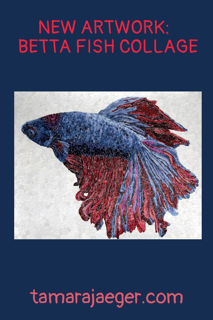
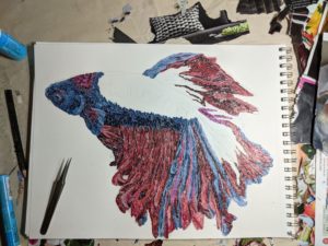
New Artwork: Betta Fish Torn Paper Collage
Wow, I guess I have a lot of pieces to update you on! This one is titled “Paradise.” Technically, it’s a pet portrait (I do more than just dogs and cats! Anything goes, really). Paradise is a Betta fish and this piece is a little larger, at 11” x 14”. I quite like working in the larger sizes since I can get a lot more detailed. I wonder how large I can go? I get this mental image of creating a piece that takes up the entire wall of a room… I… kind of want to try it.
Anyway, “Paradise” is a more ‘typical’ torn paper collage. I tear tiny pieces of paper from catalogs and magazines and attach them to a piece of paper using scrapbooking glue. The ZIG or EK Tools brand 2-Way glue is my preferred adhesive. I’m not too particular about the paper I use. Any good-quality artist’s drawing paper is fine. Recently I’ve been using Strathmore paper, which can be found in pretty much any store that carries art supplies.
I enjoyed working with some brighter colors for a change. Most of the animals I make are various shades of neutral earth tones. Nothing wrong with that—I enjoy the challenge of getting the subtle color graduations right. But sometimes, it’s fun to play with color a bit. Color’s a bit harder in some ways, since the pieces often require large amounts of the same color. Flower catalogs are good, as are some clothing catalogs, but they typically have smaller sections of color, so it can be difficult to find enough of the same (or similar) color for a large piece like this.
What’s your preference, bright colors like this or subtle earth tones?
Want to stay up to date and see more of what I’m working on? Sign up for my mailing list here and get a FREE digital download of an exclusive tiger linocut print. (I promise not to be spammy with my emails—I hate that too!)
* Please note that this post contains affiliate links and any sales made through such links will reward me a small commission – at no extra cost for you.
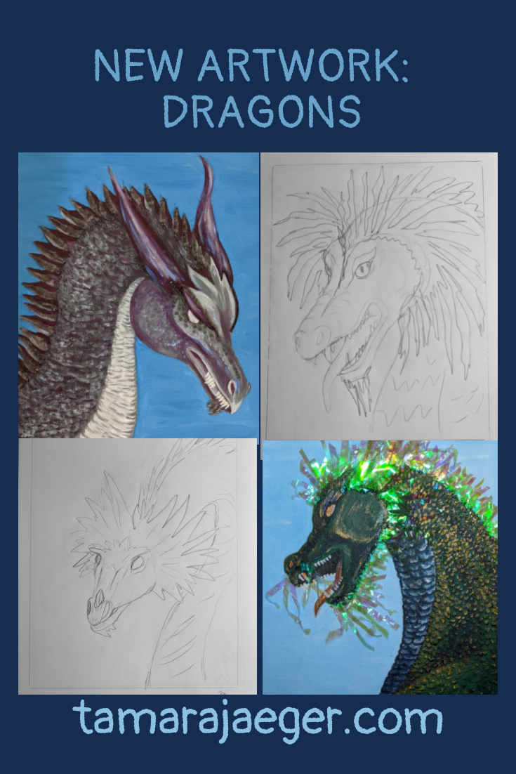
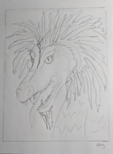
New Artwork: “Dragons” Mixed Media Series
I’ve been working on a new series of mixed media acrylic paintings, which I call the “Dragons” series. In my sketchbook, I had this noted as a completely abstract series. Sometimes things evolve a bit from the initial concept though!
I have a lot of just notes and quick, rough sketches in my sketchbook, rather than “good” art. I’m not all that fond of sketching and drawing, really. Perhaps I’ll do a post about my sketchbook sometime, so you can see my thought process. Just remember, there’s no ‘wrong way’ to use a sketchbook! If it works for you, that’s all that matters.
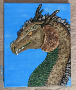
I currently have 8 dragons planned. They’re all 8” x 10” portrait-orientation pieces on canvas that combine acrylic painting with various other materials. I’m about 2/3 of the way through the series, though it’s slow going at times for some reason. None of the pieces is completely finished either. I haven’t quite figured out what to do with the eyes…
So, I suppose this is more of a sneak peek, work-in-progress post. I’ll have to update you when again they’re actually finished.
But I’m not about to leave you hanging! Here are some of the Dragons:
This is the Water Dragon.

He uses some of that shredded plastic stuff that people use in gift bags. I think some of it is also Easter grass, from Easter baskets. I’m not entirely sure… I found it on the ground in the neighborhood. I was ‘inspired’ by my Inspired Art piece that I told you about here, so I’ve been continuing to collect some of the interesting trash I find on my walks. I also used glass seed beads for texture. I quite like the look, so I’m planning on incorporating beads into all the Dragons.
Another Dragon I’ve been working on is the Shadow Dragon.

He uses pieces of purple ribbon and a grey velvet fabric that used to be part of a hair scrunchie.
Here is the Song Dragon.
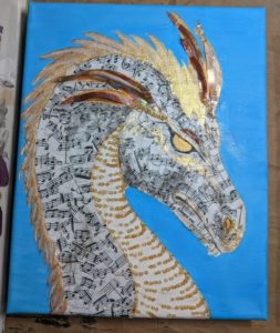
I used sheet music that I printed out and then tore into pieces, much like my torn paper collages. I used Golden Acrylic Soft Gel Medium as an adhesive. There are also pieces of reflective/metallic plastic strips (more of that shredded gift bag stuff, I think).
Forest Dragon is a little different.
He uses pieces of lichen-covered bark and some dried mushroom stuff that is supposed to be ‘vase filler.’ I think it works much better here! The horns are actually three-dimensional, made with Golden Light Molding Paste, which I also used to build up a base to hold the mushroom piece, so it’s firmly attached and well-supported.
The Fire Dragon and Ice Dragon are in the very early stages, so I’m not going to show them just yet. I call it the “Ugly Duckling” stage for a reason! I haven’t really started on the Wind Dragon or the Lightning Dragon. They’re sketched out onto canvas, awaiting my attention…
I’m considering still doing a fully abstract dragon series. There’s no reason I can’t have more than one, right?
Want to stay up to date and see more of what I’m working on? Sign up for my mailing list here and get a FREE digital download of an exclusive tiger linocut print. (I promise not to be spammy with my emails—I hate that too!)
* Please note that this post contains affiliate links and any sales made through such links will reward me a small commission – at no extra cost for you.
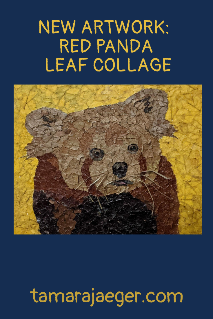
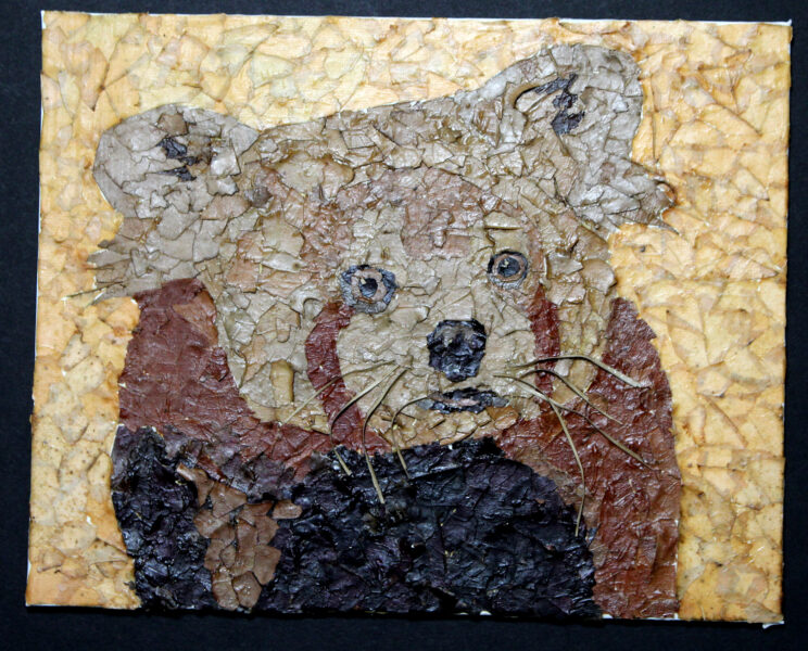
New Artwork: Red Panda Leaf Collage
Here’s another new piece. It’s actually an experiment. I have No idea how it will hold up over time!
Based on an off-hand comment from a friend about a photo I took of my dog sitting in a patch of leaves, I decided to see if it was possible to create a collage out of leaves! It’s just another material, right? Kind of like the magazines and catalogs I usually use. But different…

Anyway, I created this collage of a Red Panda using just fallen leaves that I collected in my neighborhood. I’m not entirely thrilled with the bright yellow background, but it was kind of at the end of the season, so there weren’t many non-brown colors left to choose from! White is also quite tricky to come by. I settled for a pale tan. It kind of gives the whole piece and ‘aged newspaper’ look that I think I like.

Leaves are definitely a tricky material to work with. When they’re fresh, they’re flexible and easy to tear. The next day, they’re all dried out and crispy and nearly impossible to work with! I may try keeping them in a sealed plastic box or bag to keep them flexible. Possibly in the fridge, so they don’t start to mold. Fresh, ‘green’ leaves are also something I might test out. It’s definitely a material I plan on exploring further.
Since this was a ‘test,’ it’s a little smaller than I usually make my collages and isn’t quite as detailed. I really just wanted to see how well leaves would work for collage and how well it holds up over time. I used an 8” x 10” canvas panel and my go-to “adhesive,” Golden Acrylic Soft Gel Medium. I coated the piece with Winsor & Newton Galeria Acrylic Satin Varnish to help protect the leaves (and hopefully the colors).
What do you think of the result? I’ll keep you posted on how it ages over time.
Want to stay up to date and see more of what I’m working on? Sign up for my mailing list here and get a FREE digital download of an exclusive tiger linocut print. (I promise not to be spammy with my emails—I hate that too!)
* Please note that this post contains affiliate links and any sales made through such links will reward me a small commission – at no extra cost for you.
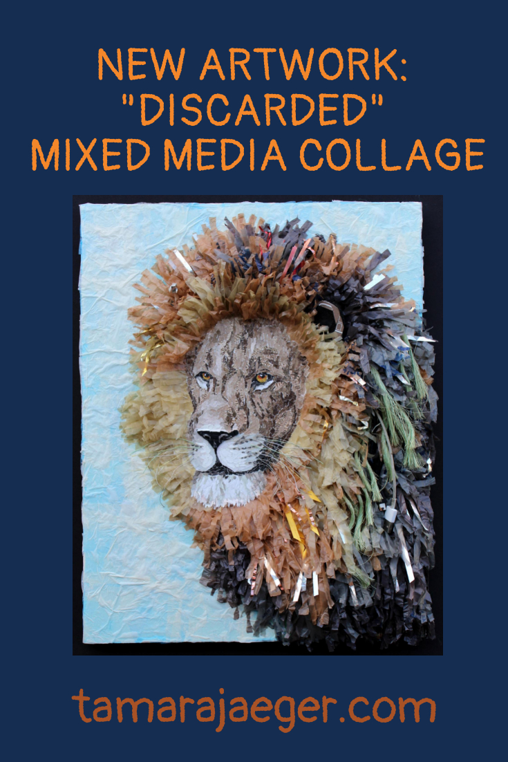
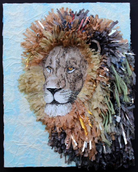
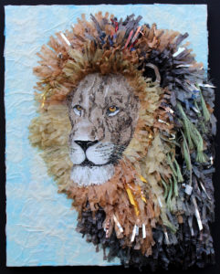
New Artwork: “Discarded” Lion Found Object Collage
I participated in the America SCORES Cleveland “Inspired Art” charity auction. America SCORES is a program that involves soccer, writing workshops, and community service projects for elementary school children in urban (and economically-disadvantaged) areas to improve their academics, physical fitness, and teamwork skills and feel empowered to lead their communities. You can learn more about America SCORES Cleveland here.
For the Inspired Art fundraiser, artists select a poem written by the students and use it as inspiration to create a piece of art. I chose the poem “Pollution” by the Mound Stem School CORE Boys team.

I was inspired by the parts where it talks about trash on the ground and in the ocean. I thought about all the trash I see everywhere around the neighborhood. So, I collected a bunch of trash that I found while walking my dog and used it as material to create a piece of art.

I chose a lion as the subject because I felt that it fit the edgy and defiant feel to the poem.
In “Discarded,” I combined my normal torn paper collage with pieces of plastic bottles, plastic bags, USB cables, rope, ribbon, bus passes, and even part of a Starbucks travel mug! However, I wanted the trash to blend in rather than being the emphasis, much like how I use catalogs in my regular torn paper collages. I wanted the piece primarily to look like “art,” rather than an assemblage of trash.
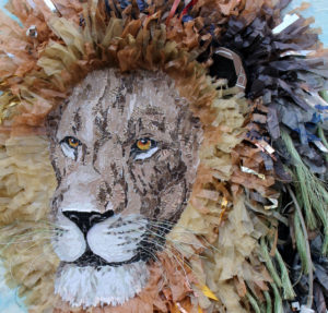
Because it uses a variety of materials, I created it on a gessoed wooden panel instead of my normal paper substrate. I also varnished most of the piece using Winsor & Newton Acrylic Satin Varnish to help protect them from dust and moisture. I left the plastic bag ‘mane’ unvarnished since all my tests turned out poorly! I had wanted to varnish that part as well, but I tried several different methods and varnishes and the fringes tended to clump and mat together and generally just didn’t look good.
I think “Discarded” turned out great and it was a lot of fun to take things in a slightly different direction. I’m considering expanding it into a series of pieces that are created with trash. What do you think? What animals would work well with this technique?
Want to stay up to date and see more of what I’m working on? Sign up for my mailing list here and get a FREE digital download of an exclusive tiger linocut print. (I promise not to be spammy with my emails—I hate that too!)
* Please note that this post contains affiliate links and any sales made through such links will reward me a small commission – at no extra cost for you.
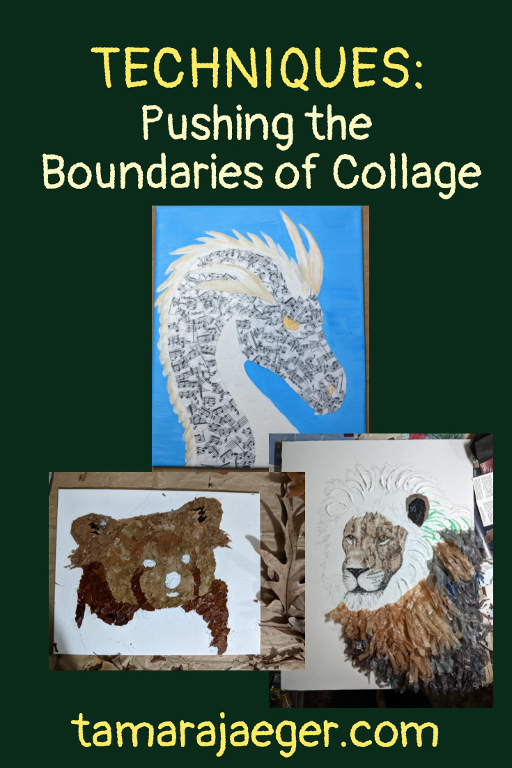
Pushing the Boundaries of Collage
I’ve been working on a lot of pieces lately that combine other materials and techniques with my ‘normal’ torn paper collage. Part of it is just to see how far I can push things. I’ve gotten my torn paper collage technique quite well-refined, to the point that the paper pieces function more like paint or another traditional medium than as collage. There’s certainly nothing wrong with the traditional collage look, but that’s not where my journey has taken me!
Part of it is a natural progression. A lot of my ‘paintings’ have shifted to be more abstract, mixed-media pieces that are increasingly three-dimensional or other wise not contained to a single, flat plane. There are pieces that are formed from multiple canvases and pieces where the ‘image’ doesn’t stay within the rectangular boundary of the canvas. It makes sense that my collages would evolve too, I suppose.
The Inspired Art piece I talked about here was definitely a jumping-off point. There’s still some of my usual torn paper collage, but it also includes a lot of non-standard materials. “Trash,” used as an art medium. The little test collage of a Red Panda I made out of leaves (you can read more about it here) was another interesting side branch and one that I think I’ll explore further. I suspect there are definite limits to what can be accomplished with leaves as an art material. But I really want to see what those limits are!

All this experimentation and exploration means that I’ve needed to adjust the materials and techniques I use, however. Normally, I use artist’s drawing paper and scrapbooking glue to attach paper fragments torn from catalogs and magazines. I intentionally use paper as a substrate, since it will respond the same way the collaged paper fragments will to changes in temperature and humidity. It’s the conservator in me! I also don’t varnish my paper collages, since the varnish is not removable and even archival-quality varnishes will yellow over time.
With the pieces that contain other materials, there are different concerns. The variety of materials means that there will always be a potential issue with how the different parts of the piece respond to changes in environment. I use a sturdier substrate, like a wooden panel, since the materials can sometimes be quite heavy, relatively-speaking, so they need more support. I use different materials as the adhesive, since scrapbooking glue isn’t strong enough or ‘bulky’ enough to hold the different materials firmly.
I also tend to use varnish more often, either on the entire piece or just on parts of it. This is to help protect the materials themselves, either from humidity changes or from the other materials. I coat the metal pieces to keep them from rusting, for example, which could damage parts of the piece that are in contact with it. The varnish also helps to give the surface a more uniform; something that’s not really an issue when I working just with paper.
Some of the materials I’ve been using in my mixed-media collages are listed below, if you are interested in my go-to products.
- Golden Soft Gel Medium
- Golden Light Molding Paste
- Winsor & Newton Galeria Acrylic Satin Varnish
- ZIG or EK Tools 2-Way Glue
- Strathmore Drawing Paper
Want to stay up to date and see more of what I’m working on? Sign up for my mailing list here and get a FREE digital download of an exclusive tiger linocut print. (I promise not to be spammy with my emails—I hate that too!)
* Please note that this post contains affiliate links and any sales made through such links will reward me a small commission – at no extra cost for you.
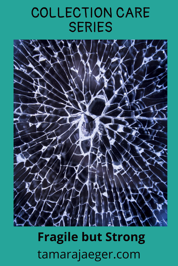
Collection Care Series: Fragile but Strong
This week we’re going to take a slightly different approach. There’s no new enemy this week. Instead, I’d like to talk about materials that appear to be resistant and strong, and go over their vulnerabilities. We’ve been focusing primarily on organic materials in this series, because those are the ones that are most at risk from environmental conditions.
What I’m going to talk about today are the inorganic materials. Inorganic materials, like glass, ceramic, metal, and stone, aren’t really all that picky about their storage conditions. These are the guys you can get away with storing in places like attics and garages. They won’t mind.
What you want to watch out for with inorganic materials in general is physical damage. They’re strong, but typically brittle. You don’t want to drop them, bump them, play frisbee with them—you get the idea. As far as storage, you want boxes or containers that protect from impact. You want sturdy boxes—preferably plastic, but you can get away with sturdy cardboard ones in most cases, and plenty of padding.
There are a few material-specific concerns you should be aware of, however, and I’ll comment on them below.

Glass: Glass is pretty inert. However, glass containers with tight-fitting lids, such as decanters, can be damaged by moisture trapped inside the container. This appears as a haze or cloudy look to the interior glass surface. Make sure glass containers are absolutely dry before storage or leave the lid or stopper off.

Ceramic: Ceramics with decorative designs or gilding can be easily damaged. Avoid scrubbing or scouring decorative glazes and gilt edges. Also, many decorative ceramic glazes and gilding contain metals are not microwave safe! You’ll also want to wash these items by hand.
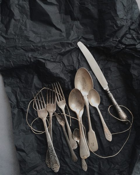
Metal: Moisture and high humidity can cause corrosion, rusting, and discoloration of vulnerable metal items. Store them in a dry area. Avoid direct contact with acidic storage materials, like newspaper or cardboard, or storing metal items in sealed containers such as plastic storage boxes or sealed plastic bags with acidic materials to prevent tarnish. Minimize polishing of metals such as silver—polishing removes a very thin layer of the metal each time it is done. Store these items with a tarnish-inhibitor made for silverware or jewelry if possible.
Are there any materials that I didn’t discuss that you have questions about? Let me know in the comments!
Missed the previous posts? Start at the beginning of the collection care series here.
Want to stay up to date and see more of what I’m working on? Sign up for my mailing list here and get a FREE collection care resource guide. (I promise not to be spammy with my emails—I hate that too!)