Posts Tagged: texture
Natural Material Woes: Leaf Collage Experiments
I wrote previously about an experiment I did using leaves to make a collage. If you missed it, you can find the post here.
A year later, I know you’re all wondering, “How is the Red Panda leaf collage looking now?”
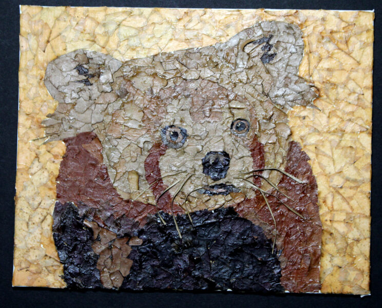
Well, actually not too bad. Most of the piece still looks pretty much the same as it did when it was first made. The only noticeable change is that the color of the yellow leaves in the background has faded. While that’s not ideal from an aging/longevity standpoint, aesthetically I’m not exactly crushed. I didn’t really like the super bright yellow color it had originally, so this more muted yellow is a bit nicer to look at.
I suspect it’s at least partially due to the yellow leaves being a bit ‘fresher’ than the brown ones, so the color wasn’t as stable. This, of course, begs the question: How will red, orange, or green leaves hold up over time?
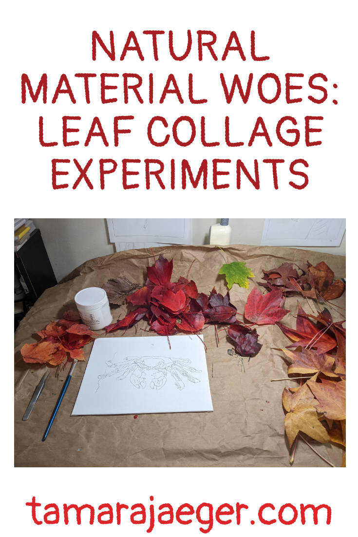
This is definitely something that needs looking into! So, I created another experimental test piece, using red and green leaves, to see how those colors will age.
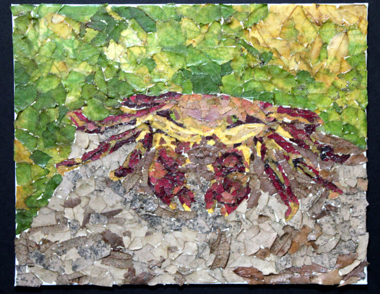
Here we have a red crab from the Galapagos islands. I thought he was pretty cool-looking and he had the right colors, so he was my test victim. I suspect I should have used a subject that had larger areas of red, like a cardinal, but oh, well! I’ll keep you posted on how this one ages as well.
If you’re curious about the materials I used (other than leaves!), here’s a list:
*Golden Acrylic Soft Gel Medium
*Winsor & Newton Galeria Acrylic Satin Varnish
I’m thinking of trying out flowers as a medium for collage as well. What do you think?
Want to stay up to date and see more of what I’m working on? Sign up for my mailing list here and get a FREE digital download of an exclusive tiger linocut print. (I promise not to be spammy with my emails—I hate that too!)
* Please note that this post contains affiliate links and any sales made through such links will reward me a small commission – at no extra cost for you.
New Artwork: Red Panda Leaf Collage
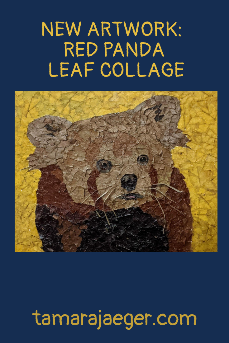
Here’s another new piece. It’s actually an experiment. I have No idea how it will hold up over time!
Based on an off-hand comment from a friend about a photo I took of my dog sitting in a patch of leaves, I decided to see if it was possible to create a collage out of leaves! It’s just another material, right? Kind of like the magazines and catalogs I usually use. But different…

Anyway, I created this collage of a Red Panda using just fallen leaves that I collected in my neighborhood. I’m not entirely thrilled with the bright yellow background, but it was kind of at the end of the season, so there weren’t many non-brown colors left to choose from! White is also quite tricky to come by. I settled for a pale tan. It kind of gives the whole piece and ‘aged newspaper’ look that I think I like.

Leaves are definitely a tricky material to work with. When they’re fresh, they’re flexible and easy to tear. The next day, they’re all dried out and crispy and nearly impossible to work with! I may try keeping them in a sealed plastic box or bag to keep them flexible. Possibly in the fridge, so they don’t start to mold. Fresh, ‘green’ leaves are also something I might test out. It’s definitely a material I plan on exploring further.
Since this was a ‘test,’ it’s a little smaller than I usually make my collages and isn’t quite as detailed. I really just wanted to see how well leaves would work for collage and how well it holds up over time. I used an 8” x 10” canvas panel and my go-to “adhesive,” Golden Acrylic Soft Gel Medium. I coated the piece with Winsor & Newton Galeria Acrylic Satin Varnish to help protect the leaves (and hopefully the colors).
What do you think of the result? I’ll keep you posted on how it ages over time.
Want to stay up to date and see more of what I’m working on? Sign up for my mailing list here and get a FREE digital download of an exclusive tiger linocut print. (I promise not to be spammy with my emails—I hate that too!)
* Please note that this post contains affiliate links and any sales made through such links will reward me a small commission – at no extra cost for you.
Artwork Series: Elementals
Earlier this week I talked a bit about creating art in a series. I’d like to talk a bit more today about one of the series that I mentioned in that post—my “Elementals” series.
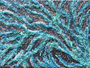
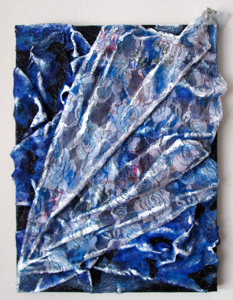
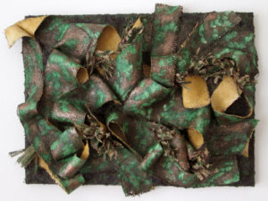
I created the “Elementals” with the intention of exploring color and texture within the framework of the four (western) elements: fire, water, air, and earth. I decided there would be three pieces for each element, each piece would be on the same size canvas, and the pieces for an element would use the same color palette. I also wanted to title each piece with the name of a mythological creature. The exact title was generally chosen after the piece was completed since the exact form of each wasn’t specified in advance—the processes I used to create the pieces weren’t really conducive to pre-defined layouts of shape and color.
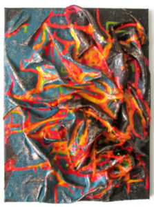
I started with the fire pieces: Dragon, Phoenix, and Firebird. These were done in red, oranges, and yellows and as you can see, the textures and designs are quite varied. The water pieces—Hydra, Kelpie, and Kraken—were done in blue-green tones while the air pieces—Pixie, Griffin, and Harpy—were done in blues and whites. The earth pieces—Golem, Satyr, and The Green Man—were done in browns and greens. I also tried to bring in texture that suited the element when possible—feathers for Griffin or the lacy, airy fabric for Harpy, for example, or the rough, earthy burlap of Satyr and the moss and pinecones in The Green Man.
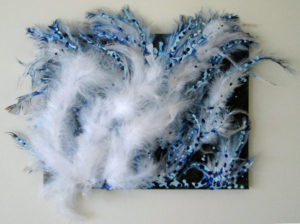
This series was about exploring how I viewed the colors and textures I associated with the four elements, my feelings behind them, rather than attempting to create predefined physical representation of the elements.
Tell me about a series you’ve worked on or have planned. I’d love to hear about it!
Inspiring Your Art: Texture
One of my favorite things to do with my art is to incorporate lots of texture. I rarely make smooth-surfaced pieces, in fact. Even the majority of my paintings have heavy texture, though it’s not usually the paint itself (like brushstrokes) that gives the texture.
I often add other materials to my paintings to add texture. This can be from various acrylic mediums or from using layers of fabric, crushed glass, or even natural materials like moss and pinecones.
When I work in mediums other than painting, I still typically involve a lot of texture. From my ceramic pieces back in college to my torn paper collages that are one of my current focuses, there’s texture everywhere!
This week, I’d like you to focus on texture in your artwork. How do you use texture? Is it with a smooth surface that is painted or drawn to appear textured? Do you use actual, three-dimensional texture? What do you use to get your effects? Can you think of any new ways to incorporate texture in your art?