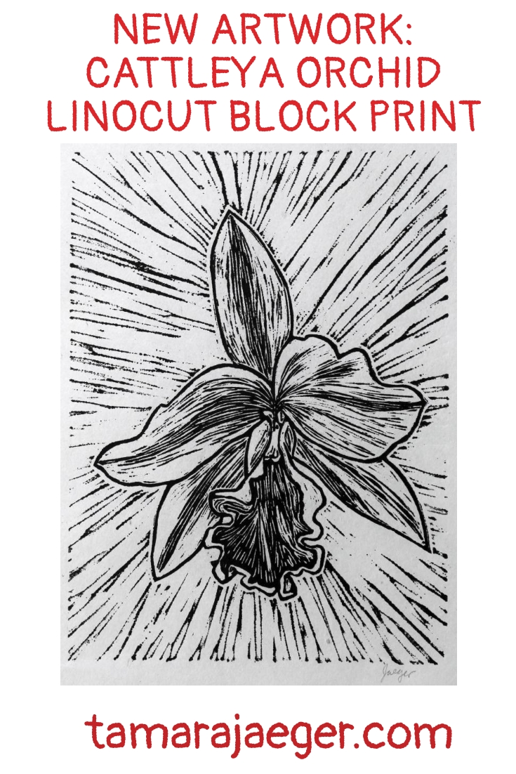
New Artwork: Cattleya Orchid Linocut Block Print
In a previous post, here, I introduced a set of linoleum block prints of flowers that I am working on. This is the second print in the set, a Cattleya orchid.
The original flower this was based on was a brilliant orange color. While I like the high contrast, black and white look of this piece, I’m considering making a few test runs of different colors, just to see what they look like. I might even try mixing up a good orange color—it’s not one that is typically found pre-made in block printing ink. This is another piece where I might try hand-painting/tinting areas of the print. I’ll keep you posted on the variations I try out.
This print, along with the other in the set, will be available for purchase shortly in both my Etsy shop and on my website.
Want to keep updated and see more of what I’m working on? Sign up for my mailing list here and get a totally FREE digital download of a tiger linocut print. (I promise not to be spammy with my emails—I hate that too!)

Inspiring Your Art: Independence Day
It’s the 4th of July today, so for your inspiration this week, I’d like you to consider Independence Day. What does Independence Day mean to you? Is it about get-togethers, picnics and cookouts? Family time and fun in the sun? Do you spend the day at the beach or the park or just in your own backyard? Is it about the fireworks? Is it about remembering where we, as a country, came from and celebrating our freedom?
I think for me, what I remember most was as a kid we’d get sparklers and smoke bombs and those strange black pellets that you light on fire and they grow into long, curly black ‘snake’ ropes. My siblings and I had a great time setting those off every year. We never had any real serious fireworks. They were illegal at the time and I think my parents always considered them a waste of money. We had a neighbor that would set off some pretty impressive displays of illegal fireworks though, so we always got to see them anyway!
What do you associate with Independence Day and how can you bring that into your art? I’d love to see what you come up with!
Want to keep updated and see more of what I’m working on? Sign up for my mailing list here and get a totally FREE digital download of a tiger linocut print. (I promise not to be spammy with my emails—I hate that too!)
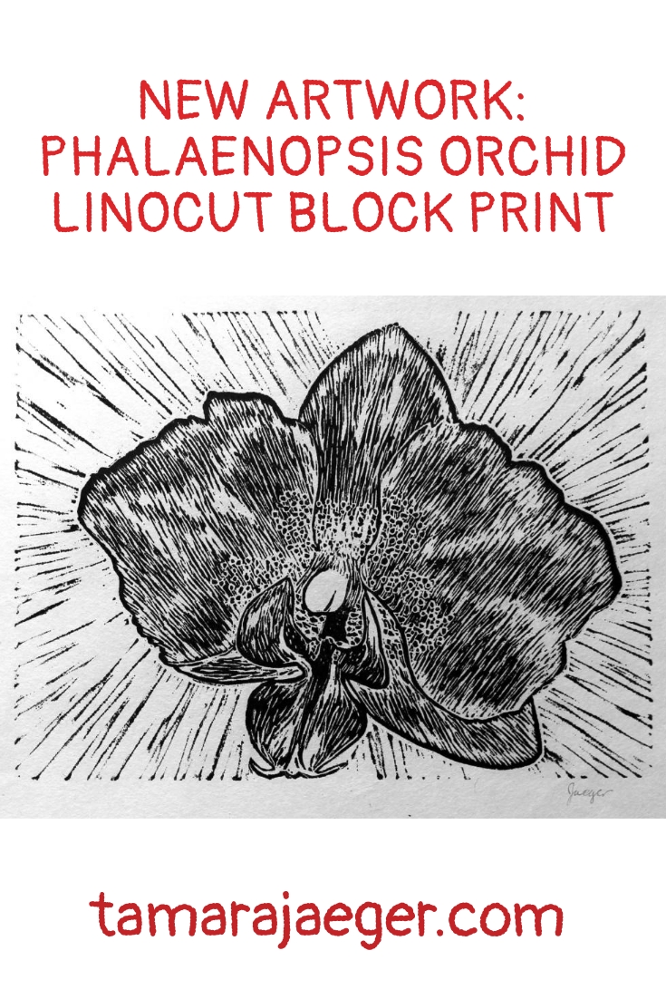
New Artwork: Phalaenopsis Orchid Linocut Block Print
I decided to take a short break from torn paper collage to work on some other things that I’ve been wanting to work on. One of those is a set of linoleum block prints of flowers. This is the first of the set, a Phalaenopsis orchid.
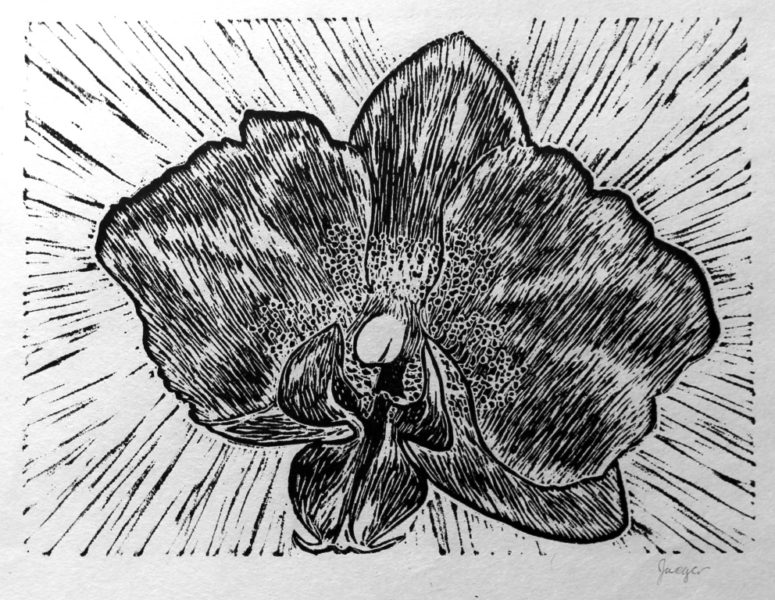
The original flower this was based on was a pale pink color, but I like the contrast of the black and white print. The rest of the flowers in this set will also be printed in black. I’m considering making a few test runs of different colors though, just to see what they look like. I might also try hand-painting/tinting areas of the print. I’ve never tried that before but I’ve seen it work well for some prints. I might have to print on a heavier paper than the Japanese paper I used here though, if I’m going to be adding color by hand. I’ll keep you posted!
This print, along with the others in the set, will be available for purchase shortly in both my Etsy shop and on my website.
Want to keep updated and see more of what I’m working on? Sign up for my mailing list here and get a totally FREE digital download of a tiger linocut print. (I promise not to be spammy with my emails—I hate that too!)
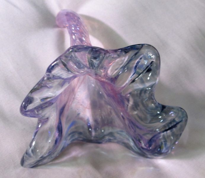
Throwback Thursday: Glass Flowers
Several years ago I took some glassblowing classes. It was something I had wanted to try for a long time, but it’s difficult to find somewhere that offers classes. Glassblowing studios are expensive to set up and maintain and beginning glassblowers are, I’m told, Very hard on the equipment! Most places, you’re lucky to get a short workshop, where you get only the slightest chance to actually work with the glass. But I got lucky—there was a glassblowing studio near where I lived that offered Actual classes! So I took the plunge and signed up for an 8-week course (Afterward, I continued for a second 8-week session).
Glassblowing was…like nothing I’d ever tried before. The closest thing is probably ceramics, which I did extensively in college and thoroughly enjoyed. But the two are so Very different. With ceramics, you get deep and dirty and hands on with the clay, then you stick it in the kiln and heat it to insanely high temperatures. Glassblowing is almost the opposite. You start with your insanely hot, molten glass and then have to try and coax it into doing what you desire, while not being able to directly touch it (trust me, you Don’t want to directly touch it. Ask me how I know!).
I found not being able to touch the glass the most difficult part, really. Sure, there was a lot of learning involved with gathering the molten glass and adjusting and maintaining the temperature while working on the piece. It was so very different from any other art mediums I’d tried. It was also challenging in that the glassworking benches are all set up for right-handed people, so as a lefty, I had to learn to do all the fine manipulation using the tools in my right hand. Some tools, like the jacks or the wooden paddles and blocks, were relatively easy. Others were not! The tweezers and shears were my biggest challenges. I’m not sure why the shears were so hard—I actually use right-handed scissors with my right hand all the time without any issues.

So one of the goals I set myself was gaining more proficiency with the tweezers. After the jacks, they’re one of the primary tools used in manipulating the glass. So every class, I’d start out by making a few glass flowers. They’re one of the more simple items to create and we were introduced to them in the first couple classes. Most of the students never made another flower after those first classes. But I was determined to master the tweezers! (spoiler alert: I’m nowhere close to being a tweezer-master. It’s something that takes years, rather than the months that I had)
Now, like I said, a glass flower is a relatively simple item to make, though admittedly it’s not simple to do Well! You gather your glass from the flaming hot hell-mouth (i.e. the furnace), roll it in the colors you want, heat it up again, then grab your tweezers and start pulling on the glass. Very carefully and precisely. So that hopefully you end up with something that looks flower-like and not like some sort of weird deformed blob.
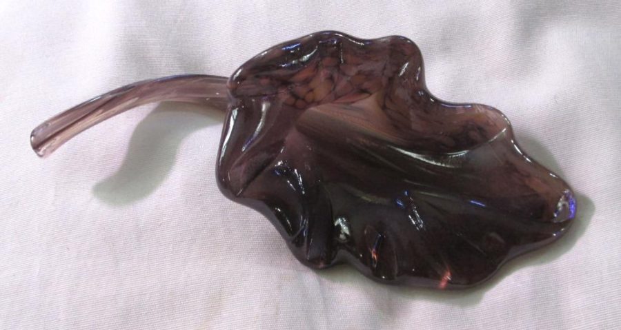
But, flowers were a quick, fun way for me to work on my tweezer prowess. I made a lot of flowers. Some of them even turned out well. I think if I had had more time (I moved to a different state to go back to grad school), I would have liked to continue with glassblowing classes. It was frustrating, but also fun and there was definitely a sense of satisfaction when I got to pick up my pieces and take them home after they had been annealed and cooled. I could See the progress I was making from week to week. I still prefer ceramics and really miss working with clay, but glassblowing gave me a completely different experience and way of looking at how to create things.
And if you’re in the Plymouth, Michigan area and are looking to try out glassblowing, check out Acorn Glassworks. They’re fantastic people, fantastic glassblowers, and fantastic teachers.
Are there any art techniques or mediums you’ve been longing to try? Tell me below!

Behind the Scenes: My Studio: The Easel
One of my favorite things in my studio is my easel. Surprisingly, it doesn’t get all that much use—I spend a lot of time working on pieces, like my torn paper collages, that need to be done on a horizontal surface. But I’m always happy when I Do get to use it!
It’s a Mabef brand easel, I think, and I got it on clearance once for a ridiculously low price but it spent the next far-too-many years sitting in its box. I had nowhere to put it as I moved around from tiny apartment to tiny apartment. But finally, (Finally!) I got an apartment that was a little larger, with a second bedroom (yes, I intentionally rented a two-bedroom apartment solely so I would have space for a studio!). So, I dragged my beloved but neglected easel out of its box and set it up and got ready to paint!
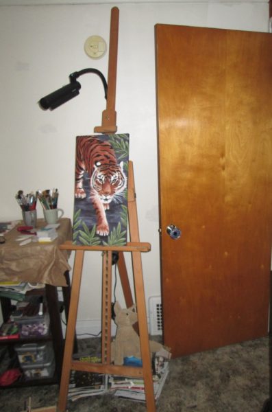
I do have other, smaller tabletop easels, which are what I used most of the time when I didn’t have the space for an actual studio. And those worked fine for most purposes. You need to work with what you have, space-wise. Lack of space for a studio is no excuse for not making art. Though I fully admit that it’s soooo much nicer now that I have a dedicated studio space.
This easel kind of represents success to me, in a way. It’s being a “real” artist and having a space dedicated to myself and my artwork, rather than squeezing art in almost as an afterthought. I do realize that my art was Never really an “afterthought”—it was always a necessity, and lacking a dedicated space doesn’t mean that I was unsuccessful or that art wasn’t important to me. It’s funny, the feelings and thoughts we attach to certain things.
What does your “studio” look like? Do you have a dedicated space for your artwork or does your kitchen table do double (or triple!) duty like mine did? Tell me in the comments.
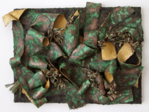
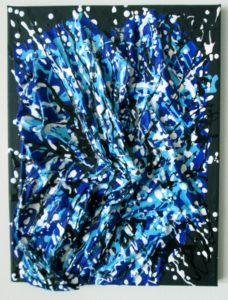
Artwork Series: Elementals
Earlier this week I talked a bit about creating art in a series. I’d like to talk a bit more today about one of the series that I mentioned in that post—my “Elementals” series.
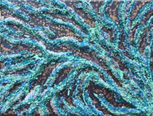
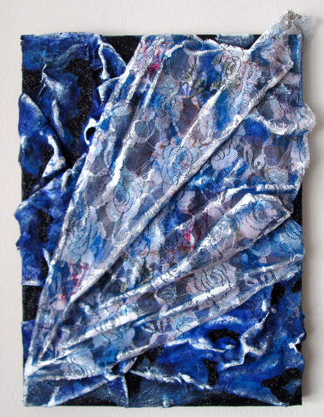
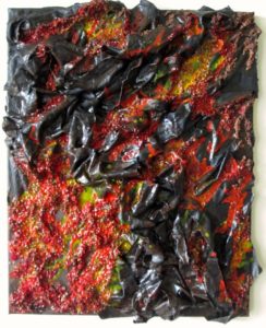
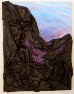
I created the “Elementals” with the intention of exploring color and texture within the framework of the four (western) elements: fire, water, air, and earth. I decided there would be three pieces for each element, each piece would be on the same size canvas, and the pieces for an element would use the same color palette. I also wanted to title each piece with the name of a mythological creature. The exact title was generally chosen after the piece was completed since the exact form of each wasn’t specified in advance—the processes I used to create the pieces weren’t really conducive to pre-defined layouts of shape and color.
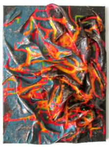
I started with the fire pieces: Dragon, Phoenix, and Firebird. These were done in red, oranges, and yellows and as you can see, the textures and designs are quite varied. The water pieces—Hydra, Kelpie, and Kraken—were done in blue-green tones while the air pieces—Pixie, Griffin, and Harpy—were done in blues and whites. The earth pieces—Golem, Satyr, and The Green Man—were done in browns and greens. I also tried to bring in texture that suited the element when possible—feathers for Griffin or the lacy, airy fabric for Harpy, for example, or the rough, earthy burlap of Satyr and the moss and pinecones in The Green Man.
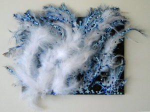
This series was about exploring how I viewed the colors and textures I associated with the four elements, my feelings behind them, rather than attempting to create predefined physical representation of the elements.
Tell me about a series you’ve worked on or have planned. I’d love to hear about it!

Life and Tips: Working in a Series
When I was in college, one of my art professors suggested that it would be good to start working on pieces that were in a series. Before that point I, like most art students, was focused on individual projects and pieces, with no attempt at creating an over-arching theme or connection between pieces. Now partly this is simply due to being a student. You take classes and your professors dictate what you should be working on to a large extent. And that’s fine, up to a certain level. But eventually you reach the point where you need to take your art further than just developing proficiency in a technique or medium. That is when working in a series comes in.
Why work in a series?
One of the main benefits to working in a series is that it gives you a chance to fully explore a subject, thinking about it deeply and fully. With a deeper understanding of your subject, you can express it on a deeper, more meaningful and insightful level than if you just create one or two pieces. For the viewer, a series provides a cumulative effect– multiple related pieces craft a deeper understanding of the artist and their work. Working in a series also creates a cohesive body of work that can, for example, be used for showing in galleries or exhibitions.
How to create a series
When working in a series, the first step is to choose your subject. Now, I’m using “subject” loosely—it doesn’t have to be a specific item or physical object, though it certainly can be. There’s absolutely no reason your subject can’t be flowers or old barns or cats or whatever else you want! But your subject can also be more abstract. It can be a technique or pattern or color. It can be a certain texture or design or even an emotion that you are exploring. Basically, your subject is the overall unifying theme for the pieces in your series.


As an example, I created my “Elementals” series to explore the four elements of fire, water, air, and earth. I also have a series—“Below the Surface”—that was inspired by a trip to a rock and mineral show. The subject for that series was geological features.
Once you’ve chosen your subject, the next step is to define what your series will consist of. Brainstorm your possibilities. I find it helpful to do a series of quick sketches to lay out my ideas. These are mostly just rough, gestural sketches—not detailed, specific images—which help me to visualize the series and the connections between the pieces. Detailed sketches can come later, when you’re ready to start creating. Set your series specifications. How many pieces will be in the series? What size or sizes will they be? Consider your sketches and ideas with the focus of seeing how these pieces will form a cohesive set.

For my “Elementals” series, I knew that I wanted to have three pieces for each element and all the pieces were going to be on the same size canvas. I wanted to explore color and texture, and having the same canvas size helped to create a sense of unity for the pieces. “Below the Surface” was a little different. Each piece was wildly different in size, shape, color and texture. The unifying feature here is primarily the subject itself. This is also a series where I had many more ideas than made it into reality. Of course, there’s no reason I can’t go back and add to the series. All it takes is a trip back through my sketchbook to remind myself of the ideas and then set myself to bringing them to life.

Now that you’ve got your theme and know what pieces will be in your series, it’s time to get to work and make art!
What about you? Do you work in series? If not, why? If so, what things do you consider when developing your series? Tell me in the comments!
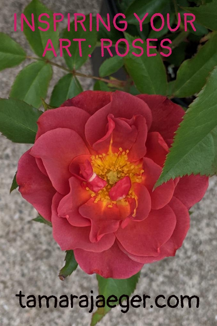
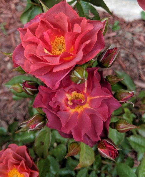
Inspiring Your Art: Roses
For your inspiration this week, I’d like you to think about roses. They’re more of a summer flower to me, rather than a spring one, though my roses are all blooming right now. I just extended the landscaping along the side of my house and purchased two new rose bushes to help fill in the space. The images here are of flowers from those two bushes.
I don’t have a theme or overall plan with my landscaping, I confess. I mostly find plants that I like and then figure out where I’m going to put them. I couldn’t resist the vibrant colors of these two roses, so home with me they came! I love color and flowers can have some of the most intense, vibrant colors I’ve seen.
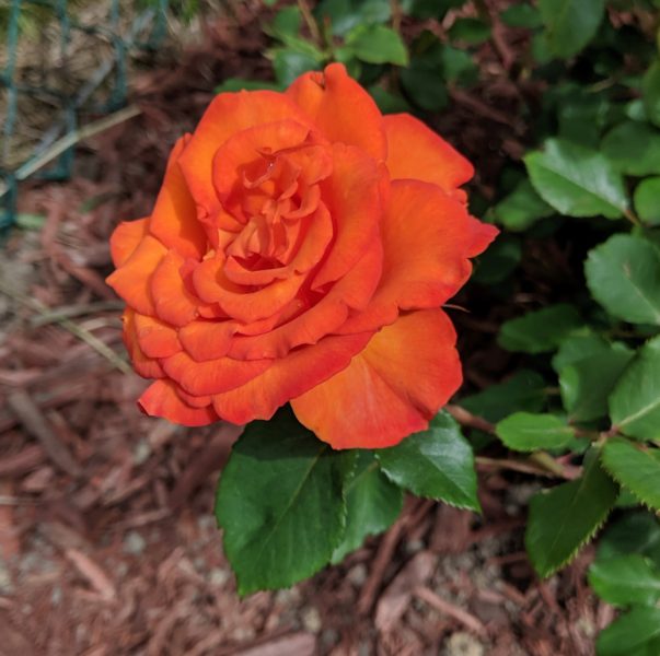
But anyway! Roses have many traditional meanings—there’s a whole language of meanings associated with the color of the rose (and for different flowers as well). That’s certainly an aspect you can explore with your art, if you’re so inclined. Other associations exist too, including a wealth of feelings and associations around the thorns—another potentially good topic to explore with your art.
I lived for several years in Aberdeen, Scotland, which is known for its roses. There are roses throughout the parks and gardens. They claim to have over two million roses in the city! So in a way, roses symbolize Scotland to me, though I have a stronger association with daffodils, of which there are also millions in the springtime in Aberdeen.
What do roses mean to you? How have you (or can you) use them in your artwork? I’d love to see what you come up with!
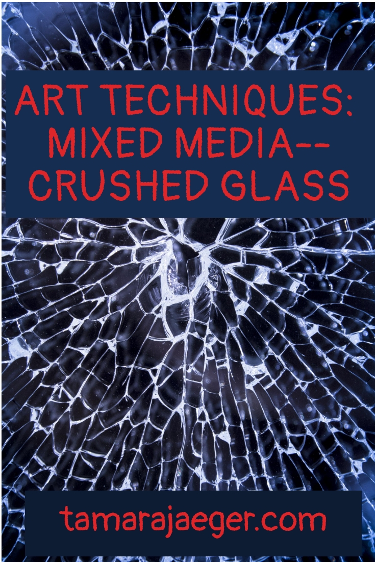
Art Techniques: Mixed Media: Crushed Glass
One of the materials I’ve found useful and interesting when working on my abstract mixed media pieces is crushed glass. It’s not a typical art material, so it can be difficult to get a hold of at a good price. I often find it in stores that sell home décor items—usually in the aisle with the vase fillers and candles. Sometimes I even get lucky and find some at the dollar store!
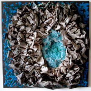
Generally I will use crushed glass when I’m trying to add a thick, sharp, chunky texture to a piece, though it’s also useful for it transparency in certain situations. In my “Below the Surface” series, I used crushed glass in a number of pieces, since the inspiration for the series was rocks, minerals and geological features. The glass makes good ‘crystals’!
In Glacier, I wanted the clear, translucency of the glass to remain, to simulate ice crystals, so I attached it directly with my trusty acrylic soft gel medium, which wrote about previously here. Geode was similar, but I used a blue-tinted glass instead of clear. A difficulty with this method is that no matter how much soft gel medium
you put down first, there will always be some glass pieces that didn’t stick well and fall off when you move the piece.
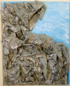
Crushed glass can also be used more for the texture, which is how I used it in Cave 1 and Crevasse. In these pieces, I attached the crushed glass by sprinkling it over a thick layer of soft gel medium, but then I used acrylic paints thinned with pouring medium
the top of the glass. This gives me the coarse texture without the translucence and also helps to make sure the glass fragments are securely attached to the canvas.
Other potential drawbacks to using crushed glass are the sharp glass fragments than can get scattered over the floor. I tend to work in my studio barefoot, so this can be hazardous. Though admittedly, most of the glass pieces aren’t lethally sharp or anything. I’ve never actually gotten one stuck in my foot, anyway. They’re still not too comfortable to step on. The glass also can add quite a bit of weight to the finished piece, depending on how much glass is used. Kelpie, from my “Elementals” series, for example, is heavy enough that it needs a pretty sturdy hanger to keep it on the wall. I was using those 3M Command Picture Hanging Strips in my previous apartment and I think it took 4 strips before the piece stopped falling off the wall. (Also, if you haven’t tried 3M Command Strips
, they’re Awesome. Especially in a rented apartment where you can’t or don’t want to put holes in the wall.)
What unusual materials have you used in your art? Are there any materials you’ve seen somewhere and thought “Hey, that might look pretty cool in my artwork”? Tell me in the comments; I’d love to hear about it!
* Please note that this post contains affiliate links and any sales made through such links will reward me a small commission – at no extra cost for you.