Posts in Category: Throwback Thursday
Collection Care Series Throwback Thursday: Fox Collage
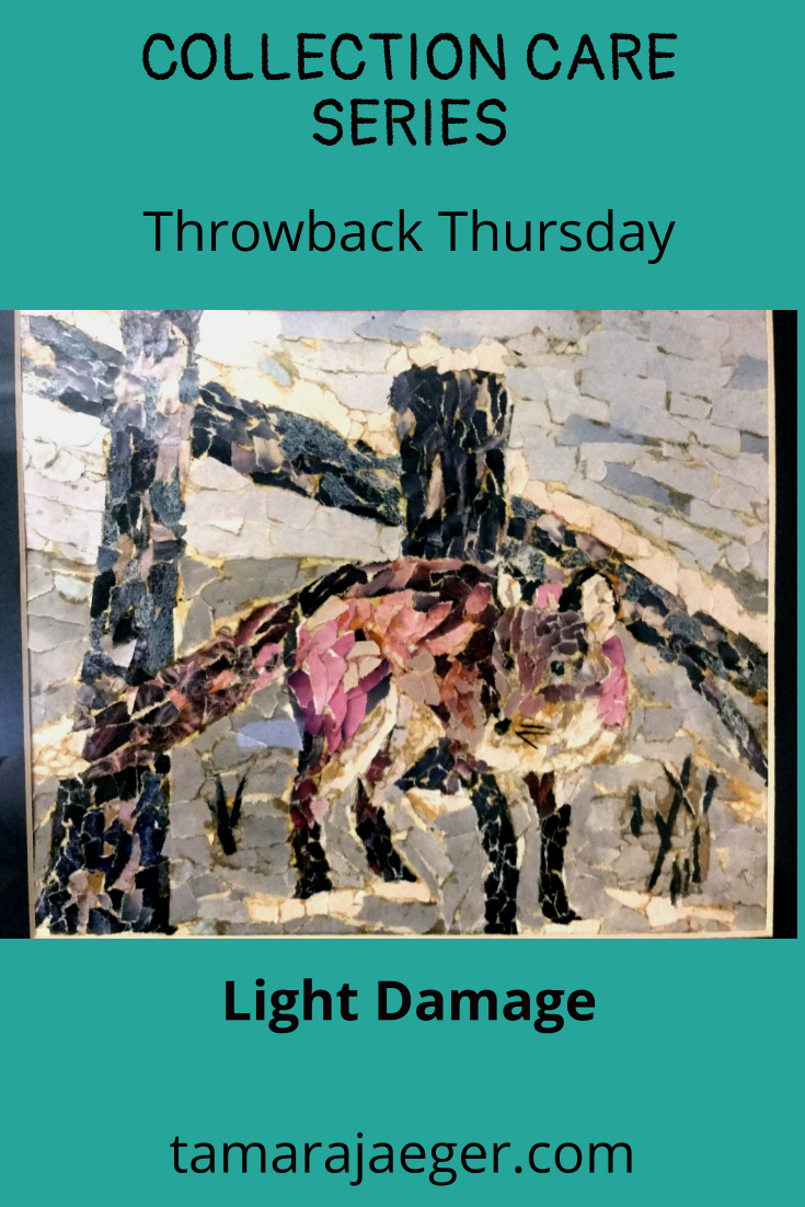
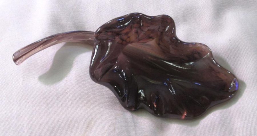
Last week we talked about light damage. So as an example, I wanted to share with you one of my earliest torn paper collages. Now, as far as preservation goes, it’s had a rough life. It was displayed for over 20 years right next to a window in an office. It got a Lot of light, and you can definitely see the effects of that.
Unfortunately, I don’t have a photo of what it looked like when it was first made, but you can still see the fading and discoloration. Some of the discoloration is of the adhesive used to attach the magazine pieces to the paper—that’s likely a combination of light damage and the acidic nature of the adhesive (rubber cement, in this case).
Overall, considering the amount of light it got, it’s in surprisingly good shape. The colors have shifted, the blues in particular have faded a lot, but it’s still apparent what the subject is. At least it provided a lot of enjoyment over its lifetime!

Do you have any examples of light damaged artwork? Feel free to share in the comments!
Missed the first post? Start at the beginning of the collection care series here.
Check out the next collection care post on moisture here.
Want to stay up to date and see more of what I’m working on? Sign up for my mailing list here and get a FREE collection care resource guide. (I promise not to be spammy with my emails—I hate that too!)
Throwback Thursday: Wita’s Gift Limited Edition Print
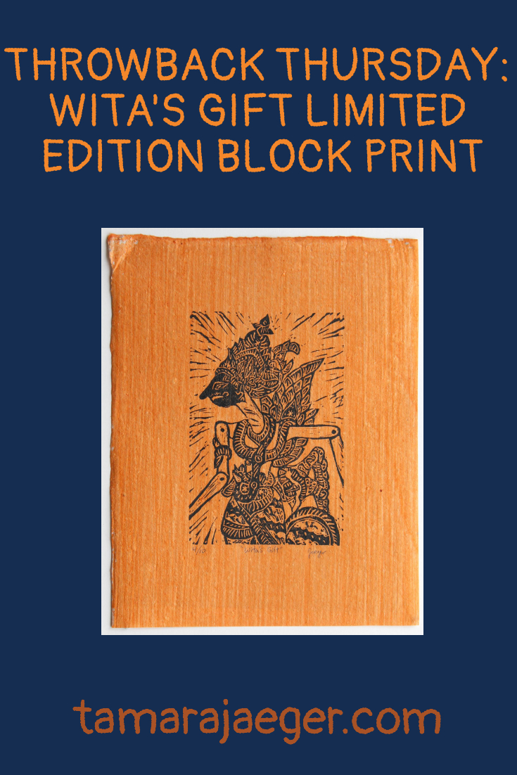
I picked up some fascinating paper on clearance a while back called “Shell Paper.” It’s a handmade paper with a coating made and emulsion of crushed shell, giving the paper an iridescent surface. It comes in several colors, each made with natural colorants.
I decided to try out the orange paper with my ‘Wita’s Gift’ shadow puppet design, since I thought the black-on-orange would be a great color scheme that would work well with the subject matter. You can get yours here or in my Etsy shop, here.
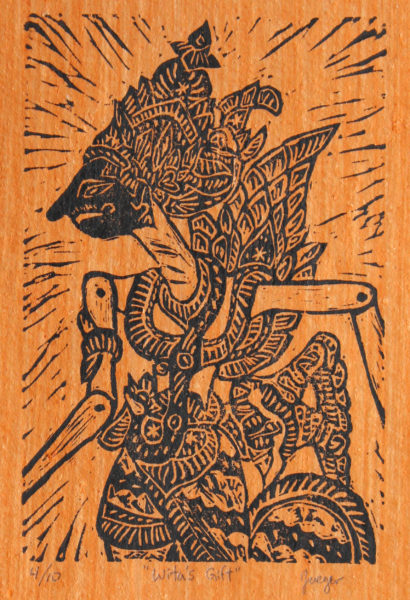
I have to say, I really like the look! I might try out a few different colors, but the orange is the most dramatic—most of the other colors are more subtle. There’s a yellow and a bright pink that are also pretty vivid, but I’m not sure they would work as well with the design.
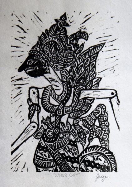
What do you think? Do you like the black and orange or do you prefer the original black and white version?
Want to keep updated and see more of what I’m working on? Sign up for my mailing list here and get a totally FREE digital download of a tiger linocut print. (I promise not to be spammy with my emails—I hate that too!)
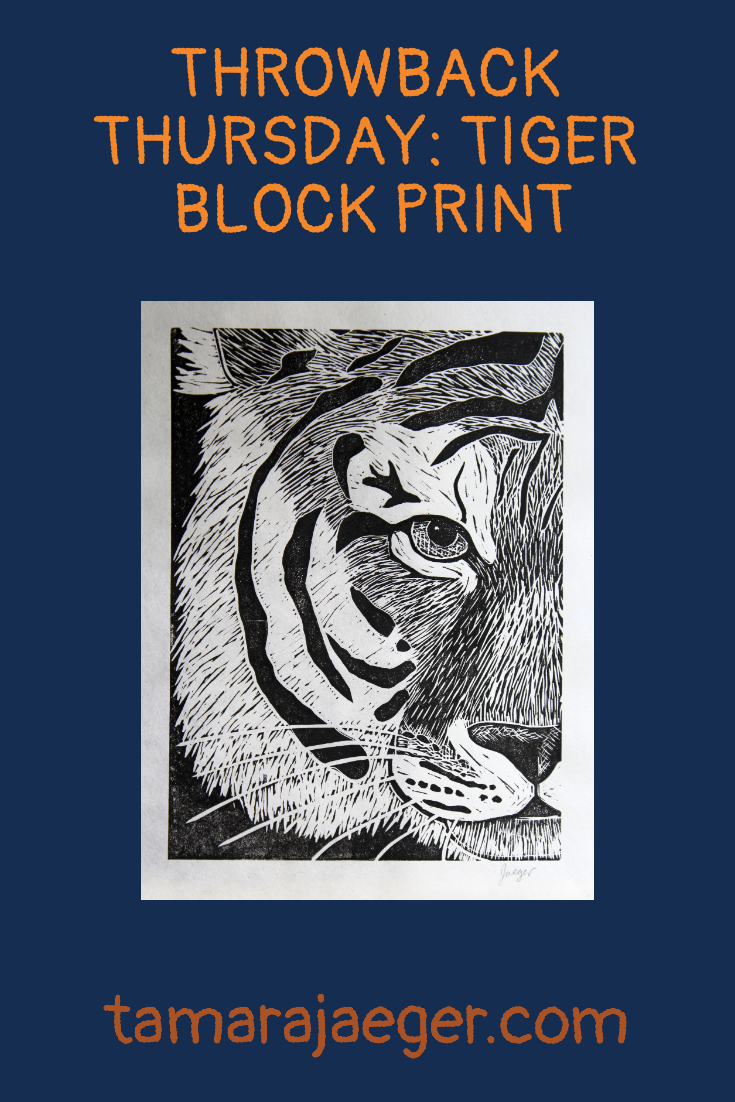
Throw Back Thursday: Tiger Linocut Print
This is still one of my favorite linocut prints. It’s based on a tiger at the Beardsley Zoo in Connecticut. The original version of this print was done using a water-based ink but I’ve since switched to a water-soluble oil-based ink and greatly prefer it!
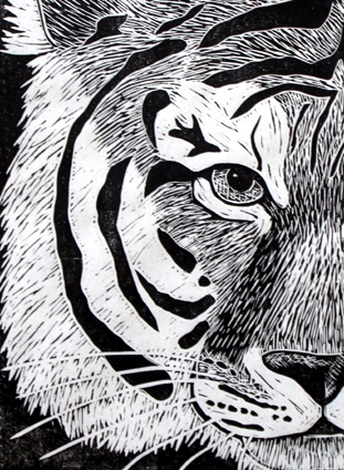
It’s a great, timeless piece in a striking black and white monochrome. I’m thinking of making another, similar tiger print. Wouldn’t that make a great pair? In the meantime, however, you can grab this fine gentleman right here in my shop or, if you prefer, over here in my Etsy shop.
Want to keep updated and see more of what I’m working on? Sign up for my mailing list here and get a totally FREE digital download of a tiger linocut print. (I promise not to be spammy with my emails—I hate that too!)
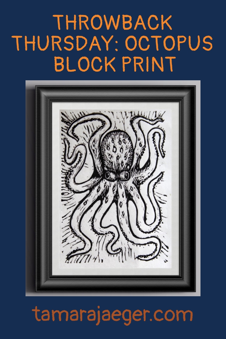
Throw Back Thursday: Octopus Block Print
I first made this fun little guy a few years ago. It was carved into one of those weird, rubbery linoleum-alternative blocks.
I’ve tried out a couple of them and they’re decent enough. Soft and easy to carve. I’ve heard people complain that you can’t get good detail using the softer material, but I’ve never had any problems carving fine details. I will admit that I prefer linoleum though.
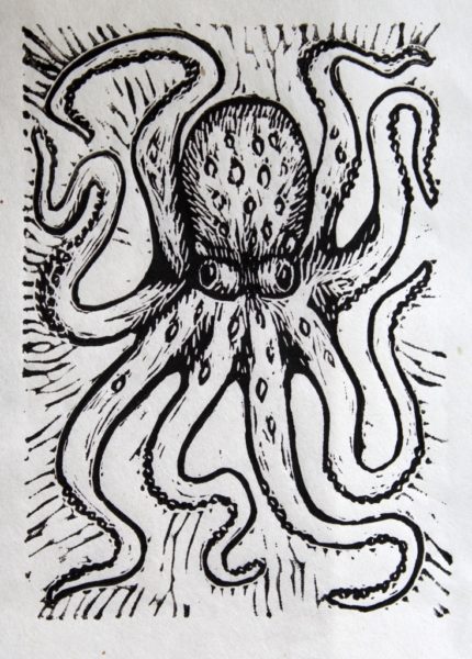
The original version of this print was done using a water-based ink but I’ve since switched to a water-soluble oil-based ink and greatly prefer it!
Spruce up any room with a dash of nautical flair and grab yourself this playful octopus print right here in my shop or, if you prefer, over here in my Etsy shop.
Want to keep updated and see more of what I’m working on? Sign up for my mailing list here and get a totally FREE digital download of a tiger linocut print. (I promise not to be spammy with my emails—I hate that too!)
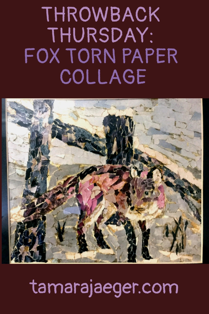
Throw Back Thursday: Fox Torn Paper Collage
This was probably my very first animal ‘portrait’ torn paper collage! I made it over twenty years ago and it’s spent most of that time hanging near a window in a brightly lit office. Considering the less-than-ideal environment where it’s spent its life, I’m actually pretty impressed that it still looks as good as it does.
Really though, I suppose the important thing is that it’s spent the last 20 years being enjoyed instead of stuffed in a dark corner somewhere!
All artwork will deteriorate over time, that’s just the nature of things. However, here is some advice on how to display your torn paper collage pieces in a way that will provide the longest period of enjoyment:
- The greatest danger is light, which will cause fading of the inks used in the magazines and catalogs that were used to create the piece. Please avoid exposure to direct sunlight or prolonged exposure to fluorescent lighting.
- Due to the delicate surface texture, your torn paper collage artwork is best displayed framed under UV filtering glass with archival quality mats.
- Keep your artwork in conditions that feel comfortable to you—avoid storing the artwork in very hot places, such as an attic or garage. Also avoid very damp areas, like basements, which can lead to mold growth.
If you have any questions about how to best preserve or display your torn paper collage artwork, please don’t hesitate to contact me here or by email at tamara@tamarajaeger.com. I’m always happy to help!
Want to keep updated and see more of what I’m working on? Sign up for my mailing list here and get a totally FREE digital download of a tiger linocut print. (I promise not to be spammy with my emails—I hate that too!)
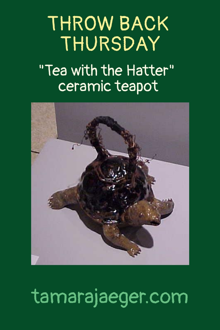
Throwback Thursday: “Tea with the Hatter” ceramic turtle teapot
This piece is a particular favorite of mine, from when I was working in ceramic in college. I loved ceramics and hope to someday have access to the facilities to pick it up again. Life goals, I guess. In the meantime, there are plenty of other perfectly good mediums to work in!
Anyway, this is a high-fired stoneware teapot shaped like a turtle. I titled it “Tea with the Hatter” to play up the Alice in Wonderland-like sense of slightly bizarre fun. It is actually a functional teapot, though I confess I’ve never used it for the purpose. The grapevine handle is reinforced inside with heavy wire to support the weight of the vessel when filled with liquid.

Are there any mediums you wish you could try out or ones you wish you could go back to? Tell me in the comments!
Want to keep updated and see more of what I’m working on? Sign up for my mailing list here and get a totally FREE digital download of a tiger linocut print. (I promise not to be spammy with my emails—I hate that too!)
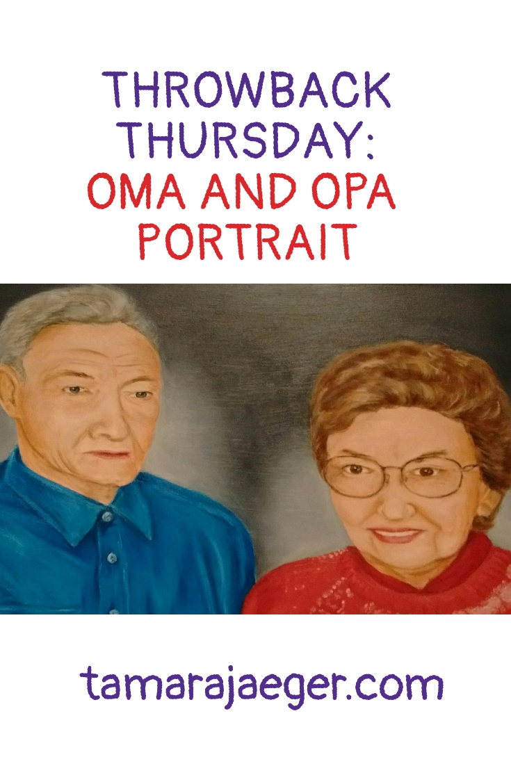
Throwback Thursday: Oma & Opa portrait
This is a fairly old piece and one of the Very, very rare paintings I’ve done of people. I don’t like using people in my artwork and portraits in particular are frustrating to me. I can paint a person, and it looks like a person. It even looks like the person it’s supposed to be. But it always seems to be missing that special something that really captures the essence of the person. Strangely, I don’t seem to have the same problem when I create portraits of animals. I’m not sure what the difference is there…
Anyway, this is an oil painting portrait of my grandparents (Oma and Opa are ‘grandma’ and ‘grandpa’ in German). I don’t remember the exact date—I painted it right before one of the times that I moved to the UK. I think it was the first time, so it’s probably from 1997.

After immigrating to the US from Germany, my Oma wanted to have a house full of oil paintings. She associated them with being well-off financially, I think. And actually, she Did end up having a house full of oil paintings, so I guess that dream was realized! I painted this portrait of my Oma and Opa as a gift for my Oma. What better gift for her than an oil painting, right? And it hung on the wall with all her family photos for years.
Oma passed away a few months ago, at almost 95 years old. She and I shared a birthday, which always seemed like a special thing. With my birthday coming up next week, I’ve been thinking about my Oma, so I thought I’d share this special piece in remembrance of her.
Want to keep updated and see more of what I’m working on? Sign up for my mailing list here and get a totally FREE digital download of a tiger linocut print. (I promise not to be spammy with my emails—I hate that too!)
Throwback Thursday: Glass Flowers
Several years ago I took some glassblowing classes. It was something I had wanted to try for a long time, but it’s difficult to find somewhere that offers classes. Glassblowing studios are expensive to set up and maintain and beginning glassblowers are, I’m told, Very hard on the equipment! Most places, you’re lucky to get a short workshop, where you get only the slightest chance to actually work with the glass. But I got lucky—there was a glassblowing studio near where I lived that offered Actual classes! So I took the plunge and signed up for an 8-week course (Afterward, I continued for a second 8-week session).
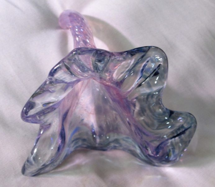
Glassblowing was…like nothing I’d ever tried before. The closest thing is probably ceramics, which I did extensively in college and thoroughly enjoyed. But the two are so Very different. With ceramics, you get deep and dirty and hands on with the clay, then you stick it in the kiln and heat it to insanely high temperatures. Glassblowing is almost the opposite. You start with your insanely hot, molten glass and then have to try and coax it into doing what you desire, while not being able to directly touch it (trust me, you Don’t want to directly touch it. Ask me how I know!).
I found not being able to touch the glass the most difficult part, really. Sure, there was a lot of learning involved with gathering the molten glass and adjusting and maintaining the temperature while working on the piece. It was so very different from any other art mediums I’d tried. It was also challenging in that the glassworking benches are all set up for right-handed people, so as a lefty, I had to learn to do all the fine manipulation using the tools in my right hand. Some tools, like the jacks or the wooden paddles and blocks, were relatively easy. Others were not! The tweezers and shears were my biggest challenges. I’m not sure why the shears were so hard—I actually use right-handed scissors with my right hand all the time without any issues.

So one of the goals I set myself was gaining more proficiency with the tweezers. After the jacks, they’re one of the primary tools used in manipulating the glass. So every class, I’d start out by making a few glass flowers. They’re one of the more simple items to create and we were introduced to them in the first couple classes. Most of the students never made another flower after those first classes. But I was determined to master the tweezers! (spoiler alert: I’m nowhere close to being a tweezer-master. It’s something that takes years, rather than the months that I had)
Now, like I said, a glass flower is a relatively simple item to make, though admittedly it’s not simple to do Well! You gather your glass from the flaming hot hell-mouth (i.e. the furnace), roll it in the colors you want, heat it up again, then grab your tweezers and start pulling on the glass. Very carefully and precisely. So that hopefully you end up with something that looks flower-like and not like some sort of weird deformed blob.
But, flowers were a quick, fun way for me to work on my tweezer prowess. I made a lot of flowers. Some of them even turned out well. I think if I had had more time (I moved to a different state to go back to grad school), I would have liked to continue with glassblowing classes. It was frustrating, but also fun and there was definitely a sense of satisfaction when I got to pick up my pieces and take them home after they had been annealed and cooled. I could See the progress I was making from week to week. I still prefer ceramics and really miss working with clay, but glassblowing gave me a completely different experience and way of looking at how to create things.
And if you’re in the Plymouth, Michigan area and are looking to try out glassblowing, check out Acorn Glassworks. They’re fantastic people, fantastic glassblowers, and fantastic teachers.
Are there any art techniques or mediums you’ve been longing to try? Tell me below!
Throw Back Thursday: Wooden Bird Feeder
This little guy dates all the way back to high school! My father made a number of different bird-shaped bird feeders like this one and I got roped into painting many of them. This particular one came back to me recently, so I thought I’d share it with you.

The bird feeder is made of wood with a clear plastic ball to hold the seed. I painted it using acrylic craft paints—the type that come in a bottle with a flip cap. Inexpensive but fine for this type of ‘craft’ project. It also has some sort of clear varnish coating. Possibly polyurethane, but I really don’t remember. Could be whatever “clear varnish” I had on hand from that went with the craft paints. I’d actually expect more yellowing by this point if it were polyurethane. Though really, on a yellow bird, it’s hard to tell if the coating has yellowed!
It’s not one of my favorites of the bird feeders I painted, I admit. But it’s an interesting look back at some of what I was working on at the time. I don’t remember the exact year, but I signed it with a nickname I used during high school, so I know it’s from the mid to late 90s. Originally it had a wooden seed tray—I’m not sure when or why it got changed out to the current PVC tray. It’s possible the original got chewed up by squirrels or something!
Do you have any “art” that you created long ago? How has your art changed since then? Do you work in a different style? Different mediums? Tell me in the comments!
Throw Back Thursday: “Bressay” oil painting
During my first undergraduate degree, I spent my Junior year abroad in Aberdeen, Scotland. I truly loved living in Scotland and would go back again in a heartbeat. During that year I traveled through Europe and a bit in Scotland as well. One of my trips was to visit the Shetland and Orkney Islands in the far (faaaaarrr) north of Scotland. Both places are fascinating, though incredibly different from each other despite being relatively close together.
The Shetland Islands are the farthest northern point of the United Kingdom. The ferry ride from Aberdeen takes 14 hours. The Shetlands are wild and windswept and bare, with no trees in sight. No traffic lights either! There are a number of prehistoric ruins as well as a wealth of wildlife—particularly sea birds, including Puffins.
After I returned to the US, while finishing my degree, I created this painting of Bressay Island in the Shetlands. You can take a ferry from the Shetland mainland to Bressay, which is a great place for walking and bird watching. I spent some time watching the waves crashing against the rocky coast, and tried to capture the power and awe I felt at the sight in this piece. The rocky coastline also reminds me a bit of the coast of Maine, where I spent a lot of summers when I was growing up.
“Bressay” is done in oil on canvas and since it’s one of my earlier pieces, I used traditional oil paints. I’ve since switched over to water-mixable oils for the most part, since they don’t require the use of solvents. I enjoy working in oils—it’s by far my favorite medium for painting. I typically work in acrylics for my abstract pieces and oils for my more realistic paintings. Though I’m considering trying oils for some abstract pieces, simply because I enjoy working with them more. I’ve also been focusing on my torn paper collages lately, which hasn’t left a lot of time for painting. That’s something I need to work on, I suppose!
What is your favorite art medium? Are there any mediums you want to work more in or have been wanting to try? What places inspire you to create art?