Inspiring Your Art: Spring
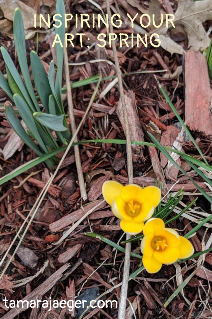
It’s officially Spring! The weather seems to be warming up, the robins are back and the flowers are finally starting to appear. We’ll ignore for a moment that it’s supposed to snow here tomorrow… In celebration of the season, I’d like you to consider this image of spring crocuses as your art inspiration for this week. These guys are currently happily blooming in my garden, which is a welcome pop of color after the cold, dreary winter.

I like crocuses. They’re one of the first flowers to brave the early spring and its unpredictable weather. They’re colorful and cheerful, like a ray of hope! They also kind of signify to me the rebirth of spring, inexorably working their way up through the dark, frozen ground.
What signifies spring for you? Is it the first flowers? The return of the robins (if you live in the north, anyway!)? Or is it something else? How do you celebrate Spring with your art?
Peacocks and Interference Paints
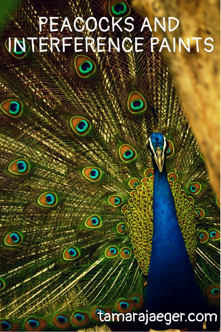
A strikingly beautiful animal, everyone is familiar with the peacock. Peacocks, or more correctly peafowl, since “peacock” refers specifically to the male, are in the pheasant family and there are several species, which are native to Asia, India, and Africa. I’ve often seen them in zoos, roaming free around the grounds and they always seem to be popular with the visitors.

Their striking, iridescent feather colors are, like many birds, not due to pigments but to structural color. Structural color is a fascinating phenomenon where the regular, periodic nanostructure of the feathers cause optical interference in the light reflected off the feather structure. The spacing of the nanostructures determines the color that is seen. These interference effects and the resulting color depend on the angle of the light.
Structural color is also responsible for the unique effects of interference paints. Interference colors are created when light waves interact and cancel out some, but not all, of the colors that make up white light. In an interference paint, an effect called ‘color flop’ can be seen, where the color changes with the viewing angle.
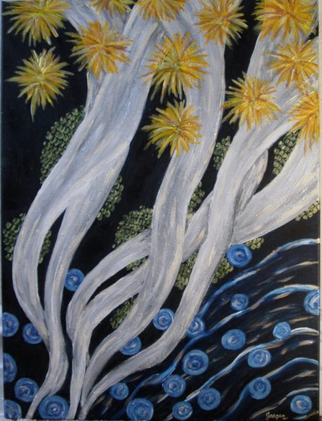
If you haven’t had a chance to try these, I’d highly recommend it—they’re a lot of fun. Golden makes some nice acrylic interference colors, and typically a few of the colors can be found in the mainstream arts and crafts stores, though more can be found online. I used both interference gold
and interference blue
in this piece, though it’s difficult to see the full effect in a photo.
Have you tried interference colors? I bet they’d be perfect for creating the iridescent effect of peacock feathers! I don’t know why I’ve never tried that before. Comment below and let me know your experiences with interference colors.
* Please note that this post contains affiliate links and any sales made through such links will reward me a small commission – at no extra cost for you.
Throw Back Thursday: “Windi” custom pet portrait
This is “Windi,” a companion piece to “Emmie,” who I introduced to you earlier, here.
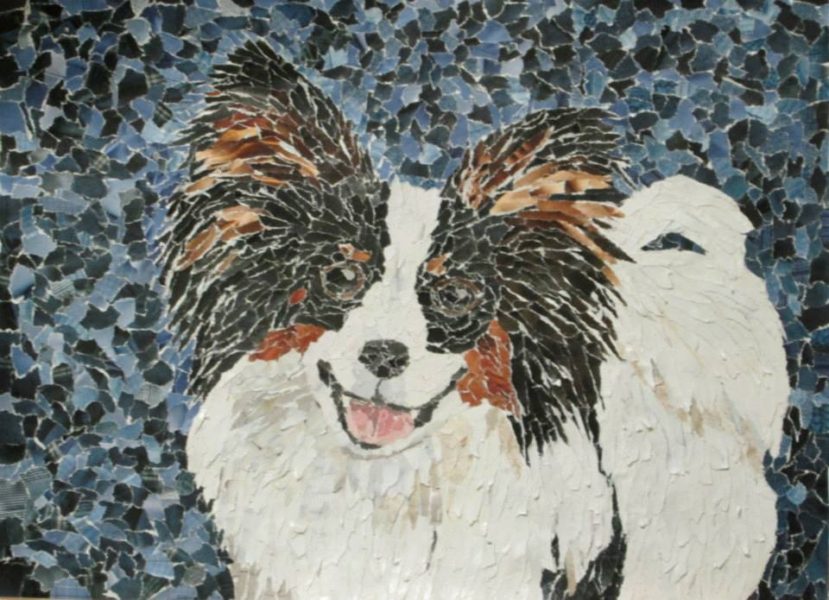
Windi is another Papillon who lives with her ‘sister’ Emmie, so these two portraits were created and intended to be hung as a pair. The challenge here was to create two separate pieces that each expressed the personality of the specific dog (and they have Very different personalities!) while still visually fitting together well. I tried to keep the backgrounds similar in color while still allowing for variation to express Windi’s more exuberant personality.
Have you ever created multiple pieces of art that were intended to be displayed together? Diptychs, triptychs, or just companion pieces, like these two pet portraits? What do you like about creating related pieces? What do you find challenging?
Interested in getting a custom portrait made of your pet? Contact me by email or fill out the request form here for more information. I’d be delighted to help!
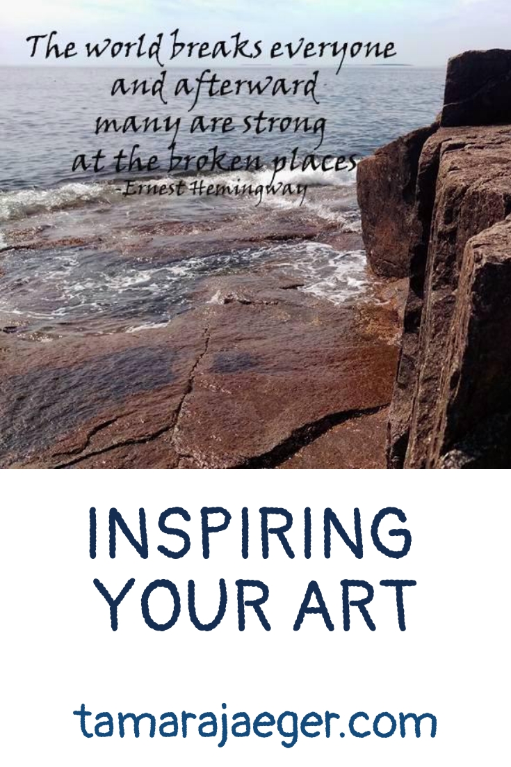
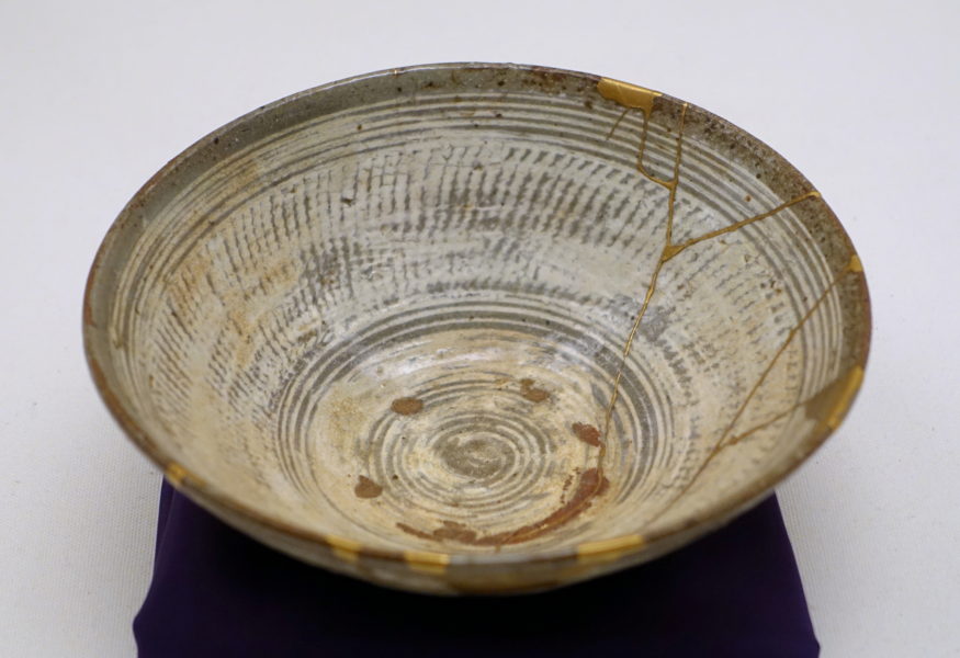
Inspiring Your Art: Broken
“The world breaks everyone and afterward many are strong at the broken places” –Ernest Hemingway
This week I’d like you to consider this quote by Ernest Hemingway, from “A Call to Arms.” I’ve always liked this quote—it really resonates with me. But I confess I’ve never really considered using it as inspiration for my art. So I thought I’d change that!
Aside from personal struggles, this quote brings to mind Kintsugi, which is a Japanese method of pottery repair that uses gold to accentuate the broken edges of the repair. This technique has its roots in the Japanese philosophy of wabi-sabi, which emphasizes seeing the beauty in the flawed or imperfect. I’ve always liked that philosophy too. It kind of cries out “Look at me! I was broken, but I fixed myself! And I’m even better than before!”
So my goal right now is to take this quote and create a piece of art based on it. I’ll share the piece when I’m done and I invite you to do the same!
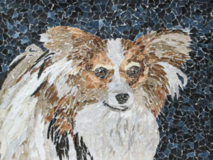
Throw Back Thursday: “Emmie” custom pet portrait
This is “Emmie” and it’s one of my earlier custom pet portraits. I actually know Emmie personally and she’s an absolute sweetheart. I do a fair number of dog portraits. They’re easier to get good photos of than cats, certainly. And I always work from photos with my pet portraits. For one, it’s difficult to get an animal to pose for any length of time! Also, it allows me to create portraits of animals I’ve never met, though I do like to be able to get a feel for the personality of the animal.

My style has changed slightly since I created “Emmie,” becoming even more realistic-looking, with finer detail. But even in these earlier pieces, capturing the personality of animal is just as important as rendering the physical likeness. Some pieces are more successful at that than others, and yes, I’ve had to completely start over on occasion when something just wasn’t working right. Fortunately, that’s not something that happens too often—there’s a lot that can be done to ‘rescue’ a piece before it gets to that point. In a collage, you can always add a layer on top of what is already there!
Have you noticed your style changing over time? Is it subtle or a dramatic difference?
Are you interested in getting a custom portrait made of your pet? Contact me by email or fill out the request form here for more information. I’d be delighted to help!
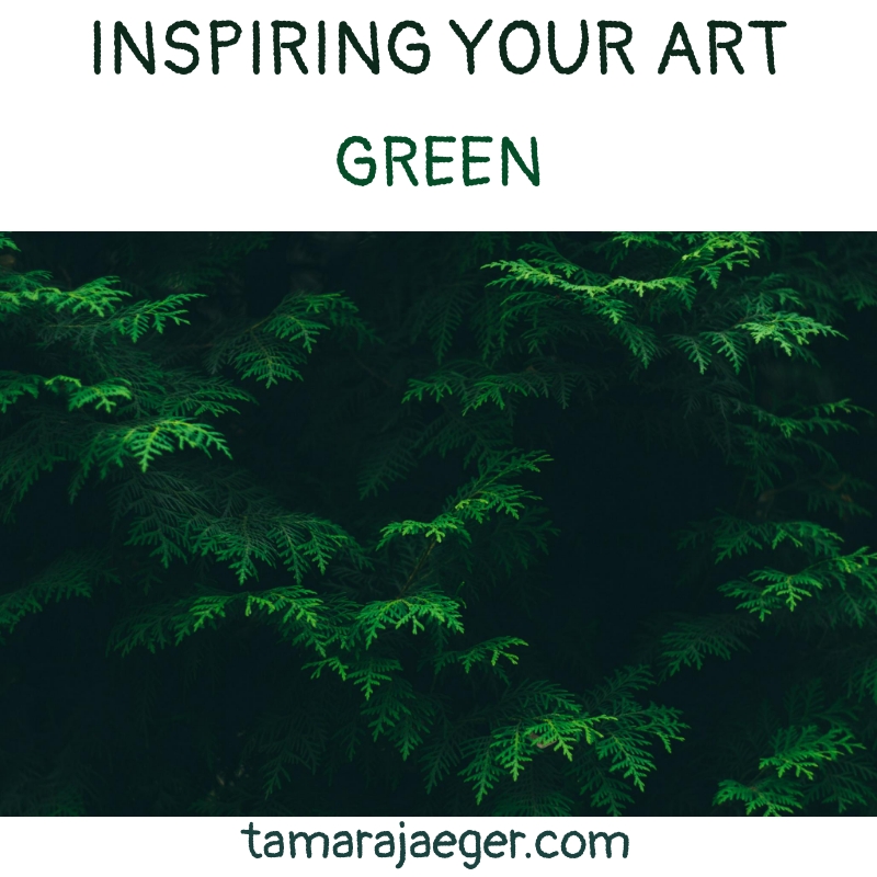
Inspiring Your Art: Green
Looking out the window today, I’m seeing a lot of white. It’s not surprising that there’s snow on the ground; it Is winter, after all. It’s pretty cold today, too. At this point in the season, I’m more than ready for spring! With that in mind, let’s pretend that winter’s almost over and spring is just around the corner.
To help get ourselves into the mindset of spring, I’d like you to consider the color green as inspiration for your art this week. Green can be warm, spring days and tiny green plant shoots starting to sprout out of the ground. Green can be wide, grassy lawns (or not, since they need to be mowed regularly. I don’t really mind yard work, but some of my friends certainly do!). Or that magical point when the trees all suddenly get all their leaves. It’s like a spring leaf explosion!
Green can also represent emotions. We’ve all heard the term ‘green with envy.’ Though I have to admit, envy isn’t really something I think of when I consider the color green. Green feels more calm and soothing to me. Though undoubtedly, the shade of green can also impact what it means. A bright, grass green feels far different from a muddy, murky, pond scum sort of green.
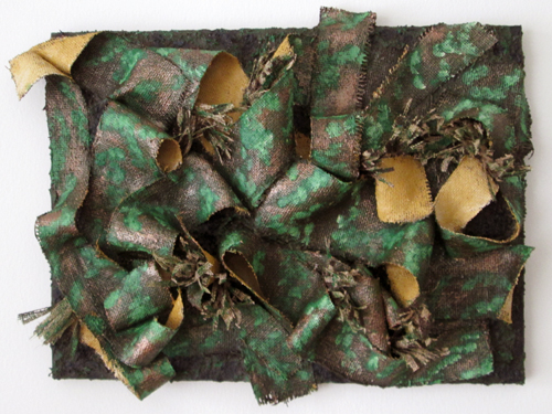
I don’t typically make a lot of artwork that is green, though I do frequently use it as a background color in my torn paper collage pieces. Of course, another take on ‘green’ could be the use of repurposed or recycled/upcycled materials. In that sense, my torn paper collages are all green!
What does green represent to you? Is it a time? A place or person? A specific emotion? How do you use green in your art?
Favorites: Jerry’s Artarama art supply online store
It can be difficult these days to find decent art supplies at good prices. It seems like the selection of artist-quality art supplies in the major craft stores like Michaels and Hobby Lobby is always getting smaller, with the focus shifting to cheaper student-quality or craft/hobby supplies. In some ways, it’s understandable—the stores have to carry what sells. But quality is important!
Several years back, I tried out some professional, artist-quality paint brushes. Wow! I had been using decent but still student-quality brushes. The difference was definitely noticeable in the way they handled and their resilience. I was hooked! I’m definitely convinced now about the benefit of using those more expensive, higher quality art materials.

Photo by Deeana Creates from Pexels
So, since it was getting difficult to find the higher quality in the stores within a reasonable distance (there aren’t really any ‘true’ art supply stores near where I live currently) , I moved my search online. My favorite of the online stores that I’ve found so far is Jerry’s Artarama. They have a wide selection of products covering a wide range of quality. There’s something for everyone. They also have a number of brands that appear to be exclusive to them. Now, frequently ‘store brand’ art supplies are of… questionable quality. I haven’t found that to be the case with Jerry’s. I’ve used a number of their own brand products and have been pleasantly surprised at the quality, especially considering their very reasonable prices.
The shipping at Jerry’s isn’t too expensive and their free shipping minimum purchase is quite reasonable (currently $35). I’ve also always been impressed with the way my orders have been packaged—I’ve never had anything arrive damaged, and I’ve ordered some pretty fragile items. I can’t really comment on their customer service though, as I’ve never had any need to contact them about an order. Their website has a very useful blog, art contests and a variety of free art lesson videos. So, next time you are searching for quality art supplies at reasonable prices, give Jerry’s Artarama a try.
Have you tried Jerry’s Artarama? What are your favorite sources for art supplies?
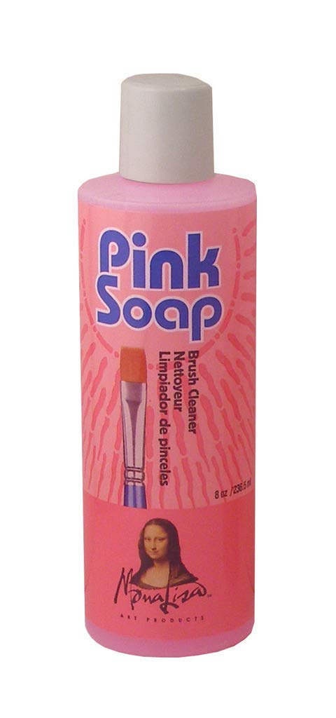
Product Review: Mona Lisa Pink Soap brush cleaner
I have a confession to make—I LOVE Mona Lisa Pink Soap Artist Brush Cleaner by Speedball. I first encountered it in college when I was looking for a decent, yet inexpensive soap for cleaning my paint brushes. I gave this one a try and I was hooked. At the time, I was using oil paints, so I used it after an initial cleaning with solvent to remove the bulk of the paint from the brush. This soap was fantastic at getting rid of the last of the paint residue and leaving my brushes clean and in good condition.
Now I paint mostly with acrylic or water-mixable oil paints, and Pink Soap tackles both of these quite easily. I use a few drops of soap in the palm of my hand and work it into the bristles, then rinse and repeat until no more paint comes out of the brush. It even does a decent job at removing dried paint and residual staining from the bristles, though no product will remove All staining. And honestly, I don’t particularly care if my paint brush bristles are stained, as long as they’re clean. The scent is pleasant and it also seems to leave my hands (and brush bristles) feeling soft. It does a great job at removing dried paint from my hands too.
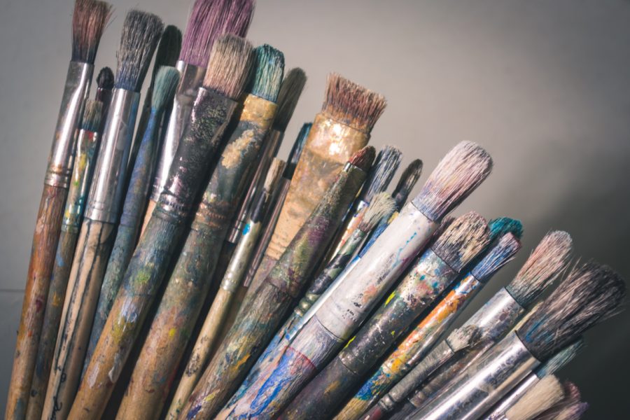
Photo by Steve Johnson from Pexels
Now, I’m not one of those people who leave their paint brushes covered in paint, so I don’t know how well this soap would work for thick, very dry paint (If that sounds like you, try this soap out and let me know how it works!). I’ve tried a few other brush cleaners over the years, but I keep coming back to Mona Lisa Pink Soap . It smells nice, is non-toxic, and not overly messy. It’s also easy to find, since it’s carried in several of the major craft stores, like Michael’s, as well as online.
What is your favorite brush cleaner? Have you ever tried Mona Lisa Pink Soap? If so, what did you think?
* Please note that this post contains affiliate links and any sales made through such links will reward me a small commission – at no extra cost for you.
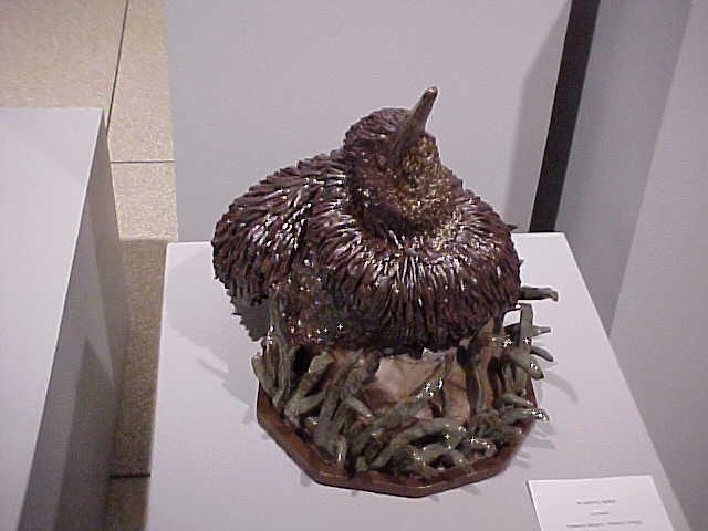
Throw Back Thursday: Wading Bird ceramic sculpture
This was one of my favorite pieces from back in college, titled “Wading Bird.” It was actually not intended to be a specific type of bird, more of a general water bird. I tended to work more with texture than color in my ceramic pieces and frequently used the raw, unglazed clay as a design element. In this piece, the ‘rock’ that the bird is sitting on is unglazed. I liked the contrast between the matte surface of the unglazed parts and the glossy, glazed surfaces.
I worked primarily in high-fired stoneware, which was fired to cone 10 (about 2400°F). An important part of the firing process was the two points where the air had to be restricted during firing to produce a reduction rather than oxidation environment, called ‘body reduction’ and ‘glaze reduction.’ Glaze reduction occurs near the end of the firing and affects the colors of certain glazes. Body reduction happens much earlier, and at a much lower temperature, than glaze reduction. If you miss either one of those stages, your pieces don’t turn out looking like you expected.
Most of the other students didn’t really care about body reduction, since their pieces were fully glazed. Mostly wheel-thrown vessels like mugs and bowls. If the body reduction was missed or the firing was uneven, well, it was only the bottom of the piece that was really affected. But for me, the color of the clay body was incredibly important!
We had several gas fired kilns at my university but only one of them consistently fired evenly throughout the kiln and could be relied on to give a nice, even body reduction. Of course, that was the largest kiln that was difficult to get enough pieces to fill completely. As a side note, a tightly-packed, evenly-loaded kiln is important to get an even firing. I tried to fire in that large kiln whenever possible. The beginning ceramics class was doing a firing? I’d be there, begging to try and squeeze my pieces in.
Often though, I had to fire in one of the smaller kilns. It was a decent kiln, don’t get me wrong, and much easier to load and fire than the large one, but it was brutally hard to get that thing to fire evenly. I have any number of pieces where the body reduction wasn’t good, resulting in some pretty ugly, patchy looking pieces. The clay I used turned a nice, rich brown when fired in a reducing environment but was a hideous putty gray in oxidation.
Wading Bird, however, was one of the pieces that turned out great! Did you have any techniques or equipment that are temperamental? Have you ever had any unexpected results? Where they bad or perhaps surprisingly good?
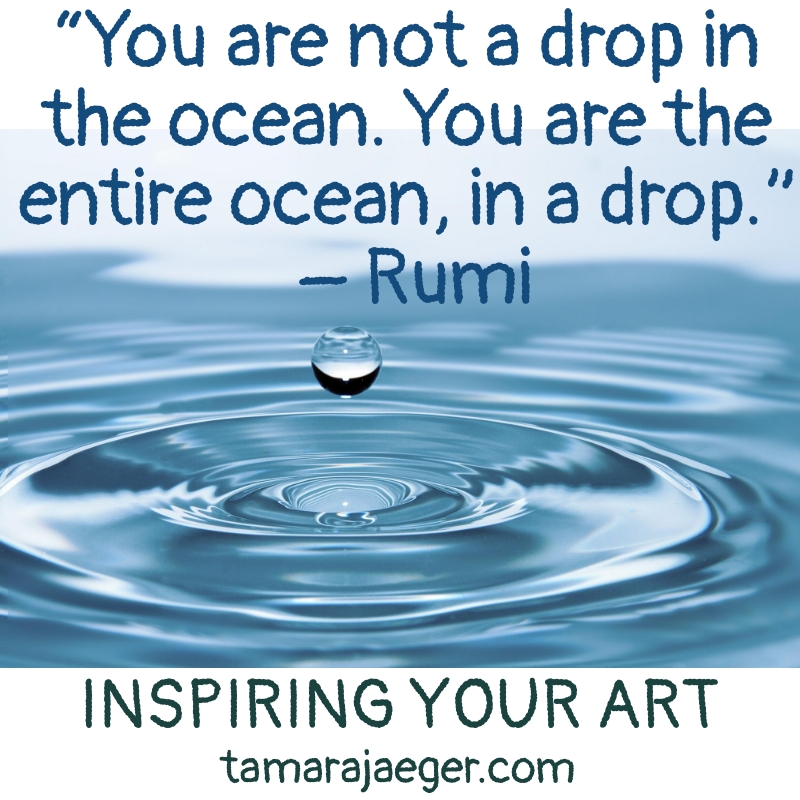
Inspiring Your Art: Ocean
“You are not a drop in the ocean. You are the entire ocean, in a drop.” – Rumi
I wanted to go with a water-themed quote for inspiration this week. I enjoy watching the ocean and miss living near the coast. This quote also speaks of the connection between the individual and a much greater whole. I think that sometimes we can get so tied up in all the many urgent details in our lives that we forget to take a step back and put everything into perspective.
I think, as artists, it’s important to remember the connection between ourselves and the ‘outside’ world. I know I find much of my inspiration in nature. And when I don’t spend time outside, it impacts not only my motivation to create art, but also my overall productivity and mood.
Where do you find your inspiration? Do you have a favorite place you go to recharge? What does this quote mean to you?