Inspiring Your Art: Sunshine
It’s that time of year when winter really starts to set in and I find myself missing warmer, sunny weather. So I think it’s time to remind ourselves, especially if you live in an area that gets cold in the winter!, that it’s not all cold, snowy days or struggling with icy roads.
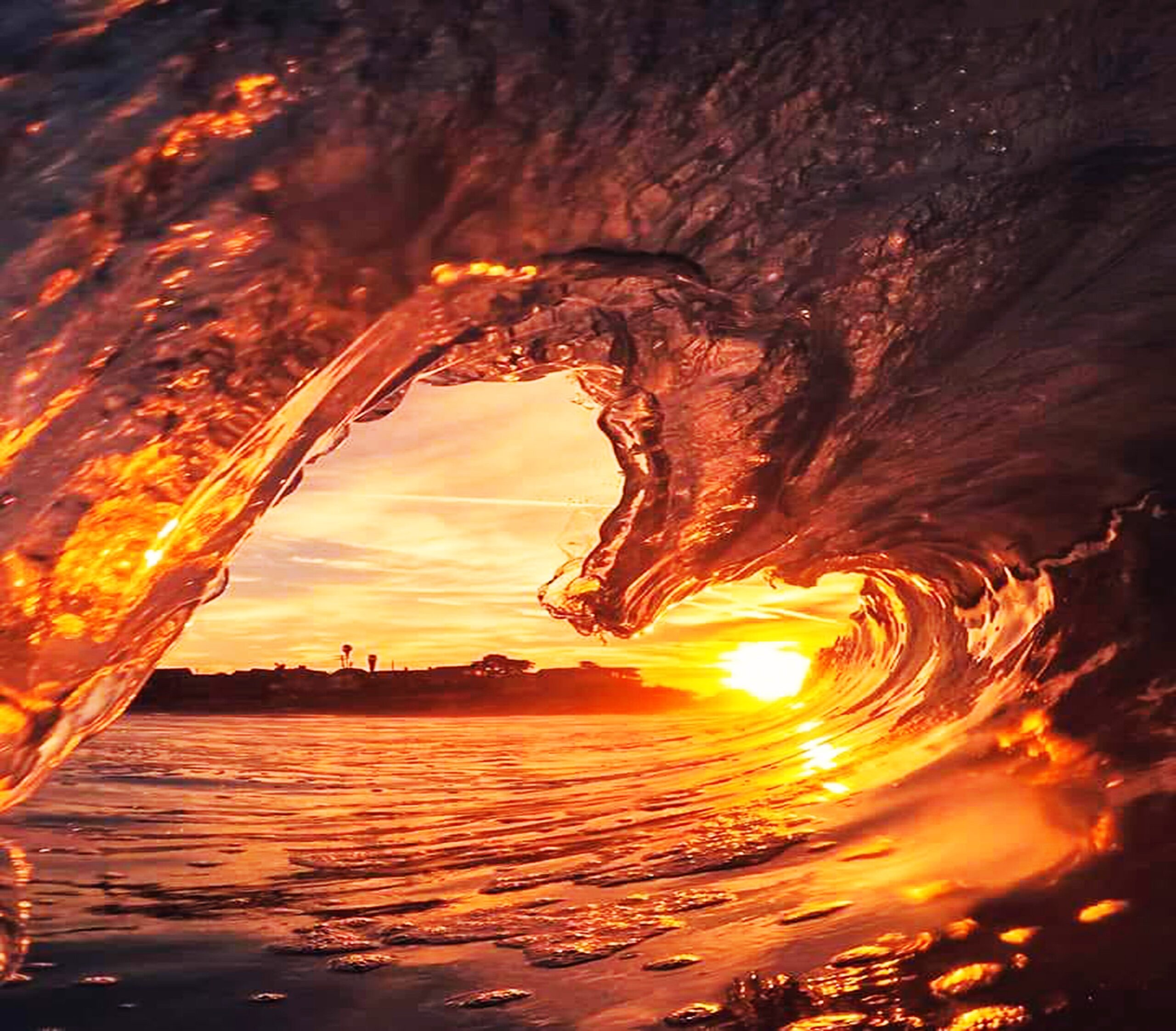
I ran across this image and I thought it would make a good focus for inspiration. I like the warm sunny feel of the photo, and oceans are always a favorite of mine. And coincidentally, it’s also Valentine’s Day, so the heart-shaped wave seems appropriate.
I’d like you to consider how you can incorporate “sunshine” into your artwork. Is it through color? What is the texture of sunshine? Can you evoke that somehow? What does “sunshine” mean to you?
New Artwork: White Stork Torn Paper Collage
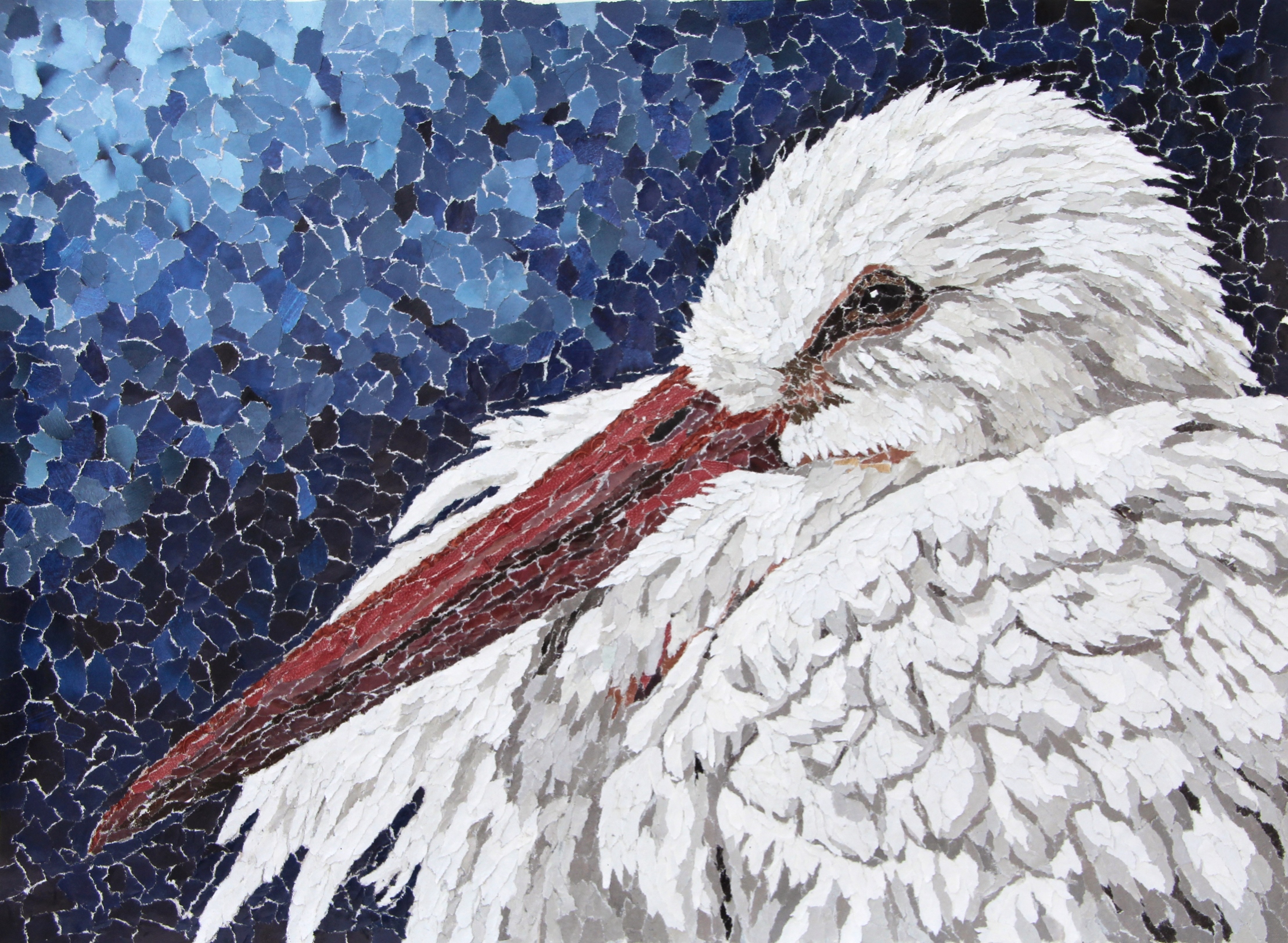
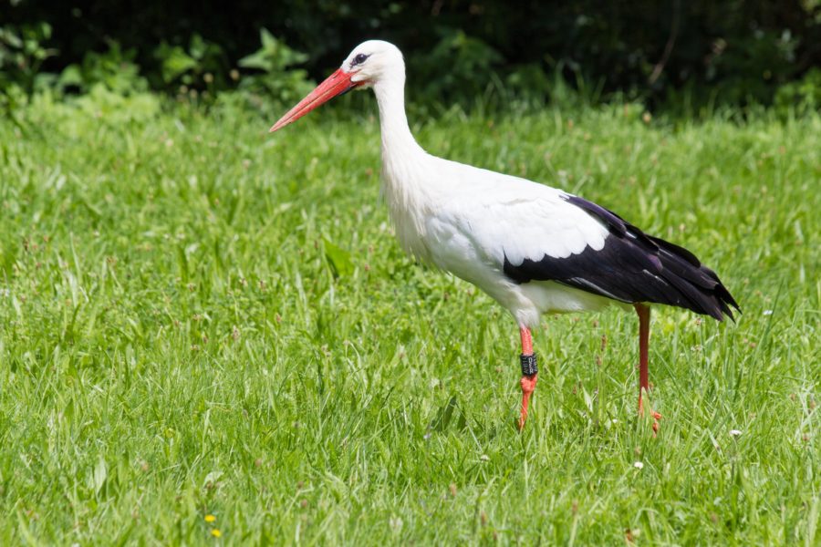
Here’s another torn paper collage that I completed recently. It’s based on a white stork at the Akron Zoo in Ohio and doesn’t have a title yet. I like the storks—they have such a nice contrast between the bright white and deep black feathers and their reddish-orange beaks. This piece also seemed to go very quickly when I was working on it. I mean, it didn’t Actually take less time than many of my other collage pieces—I can only work so quickly. It takes time to tear up and glue down every tiny paper fragment, after all. But it Felt like it went quickly!
If you’d like to own this beautiful stork, you can purchase a fine art print of it in my Etsy shop, here. It would look spectacular hanging on your wall!
Throw Back Thursday: “Sailing the Stormy Seas of Dream” Ceramic Sculpture
I had a dream back when I was in college. It was one of those strange, somewhat creepy dreams that you can’t really make any sense afterward. But there was this one image that stayed with me, of a strange puffer fish. I really didn’t remember anything else about the dream. Just the fish and the creepy feeling.
So, like a good artist, I promptly took that image and worked it into my artwork! In this case, It took the form of a ceramic sculpture titled “Sailing the Stormy Seas of Dream.”
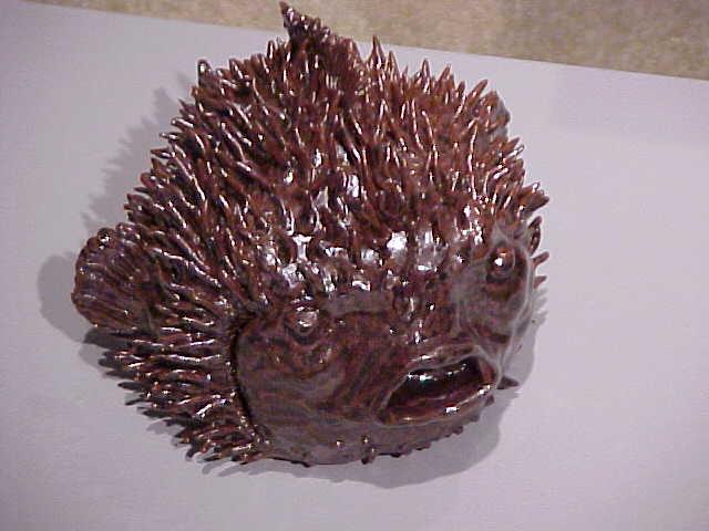
I used many tiny pieces of clay to form the spines and other details—that was a common construction method for my hand built ceramic pieces. I typically used and additive process where I worked with very wet clay and used numerous tiny pieces to build up the overall sculpture. It’s actually very similar to the way I make my torn paper collages, but more three-dimensional.
In ceramics, I took all the rules and threw them out the window. Leather hard clay? Slip and score? Nah! I worked with wet, sloppy clay and just worked the pieces together really well. Structural support was always a bit of a challenge, since the clay was so wet. I used a lot of crumpled newspaper inside the pieces for support, but even that had its challenges. If the paper gets too wet, it can’t support the weight of the wet clay.
The ‘rules’ also say you need air holes inside hollow or thick pieces. That’s another rule I learned to disregard. However, thorough drying of the piece prior to firing is critical. My bisque firings were long and slow, to make sure all the water was driven off before increasing the temperature above 200 °F. And you know what? I never had a piece explode!
So don’t be afraid to push the limits of your medium. By all means, first learn the rules. And then see what happens when you break them. It may not work. Sometimes you’ll fail spectacularly. But you will always learn something from the attempt.
Are there any art ‘rules’ you’ve broken? What was the result? What ‘rules’ do you find hinder your creative expression the most?

Inspiring Your Art: Dreaming
“What would an ocean be
without a monster lurking in the dark? It would be like sleep without dreams.”
― Werner Herzog
I like this quote. It’s not your typical “dream” quote. You know the type—“Follow your dreams” or “You can accomplish anything you dream of.” And those are perfectly fine. But today I’d like you to explore the darker side of dreaming. The dreams where you wake up with your heart racing, or the ones where you’re just totally creeped out and there’s No Way you’re getting back to sleep.
I find those types of dreams are the ones that stick with me long after I wake. And really, they’re probably the ones that I most need to learn something from. Figuring out what my subconscious is trying to tell me, however… That’s the challenge!
With this quote, I like the imagery of the sea monster hiding deep in the depths of the ocean, waiting to ambush the unwary traveler. Or perhaps, the unwary dreamer!
What does this quote bring to mind for you? Do you have any recurring dreams? Is any of your artwork inspired by your dreams?

3 ways to price your artwork
One of the perennial questions that artist ask is “How do I price my artwork?” A quick Google search gives all kinds of suggestions. You want to keep in mind that your buyers need to be able to understand why a piece is priced the way it is. It helps to have a standard pricing method, so you can explain clearly to potential buyers why a piece costs what is does. In addition, having a standardized pricing scheme helps take the emotion out of pricing your work, preventing you from pricing some pieces higher than others based purely on how you feel about the piece. This type of pricing is very difficult to justify to your buyers—they don’t care that a certain piece reminds you of your childhood friend or a favorite vacation spot.

Here, I will present three methods that can be used to price your work for sale. And remember, you can always adapt any pricing method to fit your needs.
1. Materials and time
This is one of the standard methods of pricing artwork. First, you add up the cost of all the materials you used to create a piece of artwork. Then you take whatever hourly wage you assign to yourself and multiply that by the time it took to create the piece. It’s a reasonably straightforward method of pricing and works well for pieces that have a significant materials cost and is probably one of the better methods for pricing three-dimensional work. However, I find this method lacking for artwork like my torn paper collages, which have a minimal materials cost.
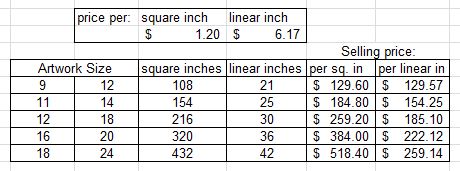
2. Square inches
This is another very common pricing method. You multiply the length by the width of your piece to get the size in square inches. You then multiply the number of square inches by a set cost per square inch to get the selling price. One of the potential drawbacks is that as the size of the piece increases, the selling price increases very rapidly. It can be difficult to justify to buyers why a piece that’s only a little larger than another one costs so much more. While it works best for two-dimensional pieces, it can also be modified for use with three-dimensional work by adding in the height of the piece and using cubic inches (length x width x height).
3. Linear inches
This is a modification of the previous method which attempts to minimize the increase in price with size that occurs using the square inch method. Like the square inch method, you take the length and width of your piece but then you add them together instead of multiply to get the size in linear inches. You then multiply by your set price per linear inch to get your selling price. Note that you will probably want to use a higher price per linear inch than your price per square inch to keep the overall price of the piece reasonable. This is the method I currently use when pricing most of my own artwork for sale.
In the example below, you can see a comparison of the last two pricing methods. Notice how the price increases much more rapidly for the square inch pricing than for the linear inch pricing. This is not necessarily a bad thing—in the end it’s Your artwork and you should price it in a way that you are comfortable with.
The thing everyone seems to agree on when pricing your artwork is to not undervalue yourself! Don’t fall into the mindset of pricing based on what you would be willing to pay—you want to price according to what others are willing to pay. Your work has value and if you want people to respect it, it needs to be priced accordingly. It’s difficult at first, especially if you’ve never sold your work before so you have nothing to go on as a starting price. Try researching what other artists are charging for similar work and start there. But always make sure that it is priced in a way that feels fair to you. Make sure you selling price covers the cost of your materials and that you are ‘paying’ yourself a reasonable wage. You want to come away feeling happy once you’ve sold your piece, not feel like you’ve been cheated because the selling price was too low.
How do you go about pricing your work? Do you use one of these methods or something different?
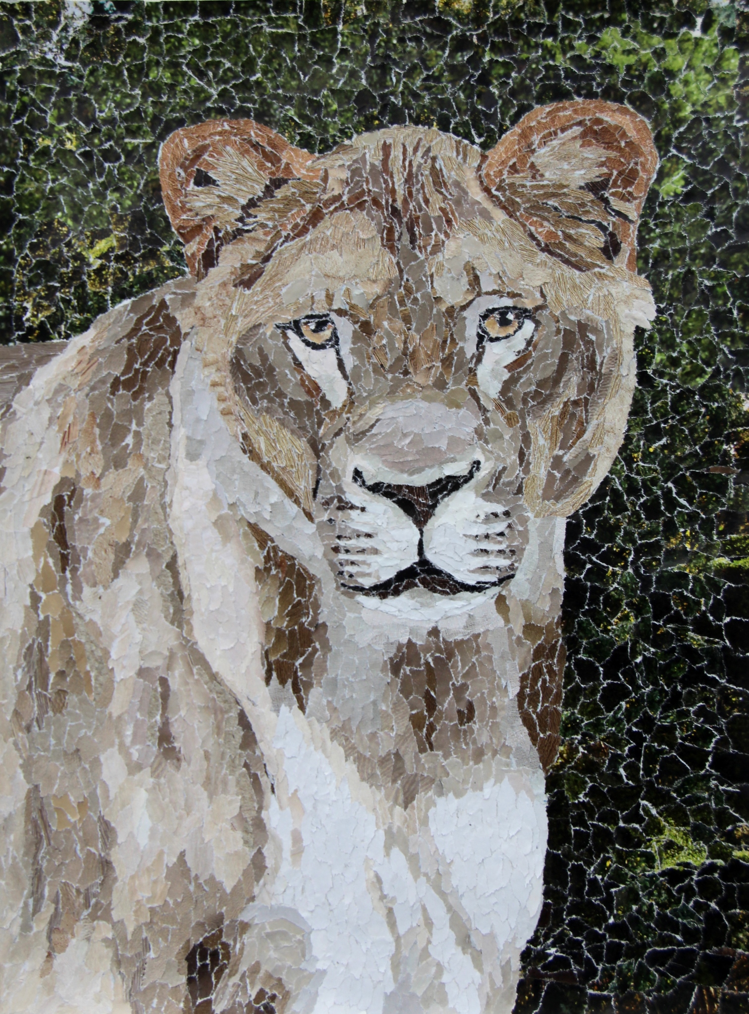
New Artwork: Lioness Torn Paper Collage
I’ve had a bit more time lately so I’ve been trying to catch up on some of the artwork I’ve been wanting to work on. This piece is a companion piece to my lion collage, Tamarr, and depicts the other lion at the Akron Zoo, named Mandisa. I think they’ll make a nice pair, hanging on the wall together.
Oh, and if you want your own copy of Mandisa, fine art prints are available in my Etsy shop here. Or if you prefer, you can get prints of both Tamarr and Mandisa here.
Throw Back Thursday: Manhattan
I took a sculpture class in college and was immediately hooked. It’s weird—I had never actually thought of sculpture as something that ‘regular’ artists do. Something that I could do. Of course, the drawback with sculpture is that the pieces tend to take up a lot of space. Drawings and paintings are Much easier to store! Sadly, it’s the lack of space—both for working and for storage—that I still find problematic and which limits the amount of sculptural work that I make. To get around this, I frequently create ‘paintings’ that are fairly three-dimensional and sculptural, but that’s a topic for a different day.
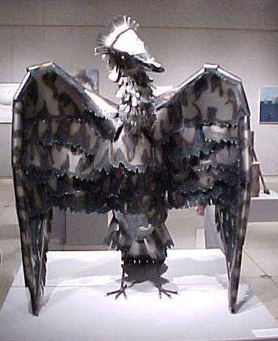
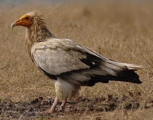
Today, I want to share with you one of the pieces that I created in my sculpture class. This is “Manhattan.” He’s based on an Egyptian vulture (mostly because I thought they looked pretty cool) and was inspired by a visit to New York City. I remember feeling like all the big tall buildings were constantly looking over me, waiting to attack. (Can you tell I’m not really a fan of big cities?) I apologize for the quality of the image–digital cameras weren’t very good back when this was taken. I’ll have to see if I can get a new photo at some point. Manhattan still lives in my mother’s garage!
Manhattan is a little over 4 feet tall and was my first foray into welding. I learned a lot making him! It gave me a whole different way of thinking about my work, with the structural elements and the decorative elements and how to combine them efficiently and effectively. Manhattan has a metal rod framework with thin gauge sheet steel pieces attached to the framework using wire. I initially tried to weld the sheet steel to the rod, but that’s Incredibly difficult to do with 24 gauge steel sheet. Beyond the scope of my welding abilities, at least. I used a torch to cut the ‘feathery’ shapes and was fascinated at how the heat of the torch produces different colors in the steel. A couple random things I learned while learning to weld: duct tape makes a great third hand. But it smells Terrible when it melts! And you can smell your leather glove burning before you feel the heat. Move your hand away quickly and you won’t get burned.
I’d love to try welding again sometime. What about you? Are there any mediums you’ve secretly always wanted to try? Or ones you’ve been afraid to try? Give it a go—you just might surprise yourself!

Animal Profile: Vulture
Vultures are scavenging birds of prey, typically with a bald, featherless head. Vultures are found on every continent except Australia and Antarctica. Most people in North America are familiar with the turkey vulture, which has a red head, or the black vulture, which is similar in appearance but has a black head. However, there are actually 23 different species of vulture!
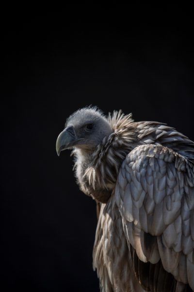
Vultures are typically social animals and congregate in flocks, which are called a committee, a venue, or a volt. I flock of vultures in flight is called a kettle and when feeding together, they are, amusingly, called a wake.
Vultures have an excellent sense of sight and smell and feed almost exclusively on carrion. While they prefer fresh meat, they can actually eat meat that is so rotten that it is toxic to other animals. This is a result of the vulture’s stomach acid being much stronger than that of other animals—the acid kills any dangerous bacteria in the rotten meat, preventing the vulture from becoming sick.
I lived in southern Maryland for a while and there were always huge flocks of vultures hanging out in the farmlands I drove through to get to work every day. I’d see them sunning themselves on the roofs of the tobacco barns in the mornings and when the fields were being plowed and fertilized for planting, they’d follow the farm equipment down the field, ready to snatch up any ‘tasty’ treats that got turned up by the plows.
Have you seen any vultures in the wild? Do you have a favorite species? What do you see when you think of a vulture?
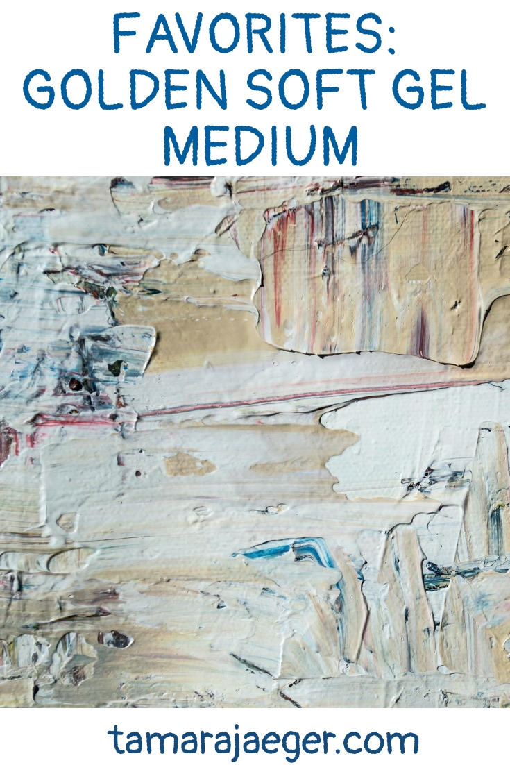
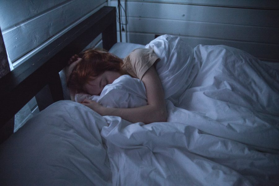
Favorites: Golden Soft gel medium
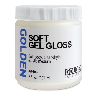
In my previous blog post, here, I talked a bit one of my go-to art materials when working on my 3-D mixed media paintings: acrylic soft gel medium. I typically use Golden Soft Gel Medium, since it’s readily available in several of the big art and craft supply stores and I like its working properties. It can also be purchased in larger size containers online, which is what I typically do since I go through a lot of it.

Photo by Steve Johnson from Pexels
Acrylic gel mediums are used to increase the transparency of acrylic paint without compromising its consistency or adhesive properties. Thicker, heavy body mediums are used to provide texture and add body to paint for impasto effects, allowing the paint to retain brushstrokes and knife marks. However, I generally use gel mediums as an adhesive in my mixed media pieces.

I like Golden’s Soft Gel Medium because it’s thick enough to fill in gaps and make a good, strong bond and it remains flexible once dry. Flexibility is an important consideration when working with organic materials, since they will flex, shrink and swell with changes in humidity. It’s also important with inorganic materials like stone or glass, since the canvas substrate of my pieces will flex with temperature and humidity changes while the inorganic parts will not. Having the ‘glue’ remain flexible allows the whole piece to hold together better and prevents pieces from popping off the canvas over time.
Golden’s Soft Gel Medium can be a little expensive, but it’s high quality and archival. It comes in several surface sheens but I usually just get the gloss version. I tend to paint over it anyway, so the surface sheen isn’t important to me. The gloss version doesn’t contain the extra mattifying agents that the other versions do and tends to be more transparent, which is important if I’m using it to attach materials like glass fragments that need to be seen through the gel medium.
Buying it in larger containers online tends to be more economical, but I’ve also purchased it using coupons at Michaels when I don’t want to wait for it to get shipped to me.
Have you tried any acrylic mediums? How do you use them in your work?
* Please note that this post contains affiliate links and any sales made through such links will reward me a small commission – at no extra cost for you.
Mixed Media Artwork—Natural Materials
When working on my abstract pieces, I sometimes incorporate natural materials into the piece to provide texture or color. Natural materials aren’t without their drawbacks—they can be fragile and may degrade quickly. Colors can fade. They can attract pests. They’re often terribly non-archival. They’re potentially a future conservator’s nightmare!
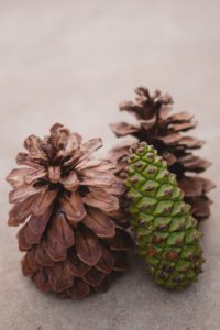
That being said, natural materials have their uses. You just need to keep in mind what you are trying to achieve with your artwork. A few years back I created a series of twelve 3-D mixed media ‘paintings’ that I called my “Elementals” series. There were 3 paintings in the series for each of the four elements: earth, air, water and fire. One of the ‘earth’ paintings, titled “The Green Man”, included moss, lichen, and pinecones.

Most of the paintings in this series weren’t planned out beforehand. Rather, I decided which element I was trying to portray, grabbed a canvas, and then pretty much just played with the materials until the piece felt done. It was a fun series to work on because I never knew quite what to expect for the final result. For The Green Man, I had a bunch of natural materials on hand and so I started with those.
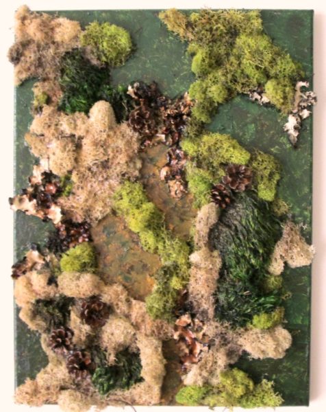
The moss and lichen I had gotten at a craft store, so it was pre-cleaned, sanitized and dried. The pinecones I collected from outside. I laid everything out on the canvas and moved things around until I liked the way it looked. To attach everything, I used an acrylic soft gel medium—this stuff makes a great glue in this type of situation! It’s thick enough to fill in gaps and make a good, strong bond and it remains flexible once dry; an important consideration when working with organic materials, since they will flex, shrink and swell with changes in humidity.
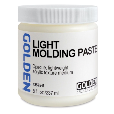
When I need to build up height or thickness or need more support for something, I use a lightweight acrylic molding paste. You can also use regular molding paste, which is denser and stronger, but also quite a bit heavier. I usually use the lightweight one to keep the overall weight of the piece down and since I typically am not trying to support anything Really heavy on the canvas.
After getting the composition set and ‘gluing’ everything in place, I used acrylic paints to finish off the piece. I also painted over the moss and lichen with the gel medium to help keep the pieces from breaking and crumbling over time. Overall, The Green Man does what I intended it to do and fits with the rest of the series, so I consider that a success!
What about you? Do you ever incorporate natural materials into your artwork? How do you combine them with more traditional art materials?